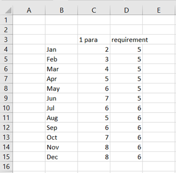
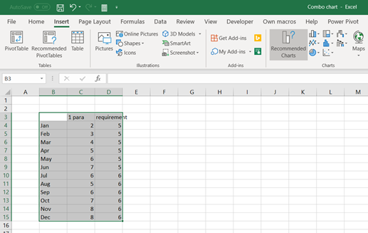
We have data per product and quarter. The data should be presented graphically.


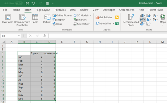
Activate the data area and select insert – 2-D column.

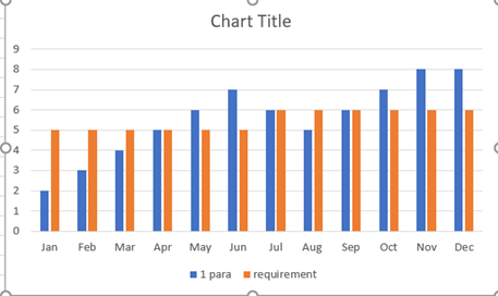
The quarters are now in three spans. We have two legends in X-axis quarter and product. This makes graph unclear to review. It is difficult to compare products with each other. It would be better to have a graph with three axis.
3-D column is presenting the same data nearly in the same way. The graph looks like 3D, but both quarters and products are in one X-axis.

To have a real three-dimensional graph, we need to have the data in matrix format not in pivot format.

A pivot is needed to have the data in matrix.

Place a cursor inside the data range.

Select insert – 3-D column and select the one furthest on the right.

This graph looks better than the previous one. As there are three dimensions, product and quarter can be set into different axis. Now we can visually compare different products per quarter.
Product 3 has highest sales throughout the quarters. During Q1 and Q2 products 1 and 2 show somewhat similar sales. During Q3 product 1 sold better than product 2. In Q4 the tables have been turned between product 1 and 2.

Another three dimensions graph is 3-D line.

Now we can compare the products visually. Whether the lines are better than columns, is a personal taste. I personally like columns more as lines are bit thin and looks like lines are flying in the graph.

To see all the chart options. Press the small arrow at the low right corner.

One three-dimensional option is 3-D area. Select area from the list on the left.

One disadvantage with 3-D area is that product P2 sales for Q3 cannot be seen as higher sales of P1 is blocking the visibility of P2.

Also surface graph can be presented in three-dimensional.

The graph is unclear to me. I could not judge the sales based on this graph. However, there might be cases and data samples, when 3-D surface is a good fit for purpose.
Three-dimensional graph works better with our data than two-dimensional graph. When product, quarter and sales are separated into different axis, the graph is easier for human reading. For me, three-dimensional columns present the data best and most convenient way, which can be reviewed quickly.