Category Archives: Business Intelligence

Maven CRM Sales Opportunities, free data sets

The dataset in this blog was downloaded from Maven Analytics free dataset Free Sample Dataset Download – CRM Sales Opportunities – Maven Analytics | Build Data Skills, Faster

The dataset is about CRM data about a fictitious company. Thanks to Maven Analytics for publishing this free data set.

The dataset includes also four questions about the data.

  • How is each sales team performing compared to the rest?
  • Are any sales agents lagging behind?
  • Are there any quarter-over-quarter trends?
  • Do any products have better win rates?

I will get back to these questions.

The data set consists of four tables. Account table is about customers. Product table covers seven product which were sold. Sales_team is defining the sales agents. Sales_pipeline is about sales transactions.

Sales_pipeline is transacational data, fact, and other tables are master datas, dims.

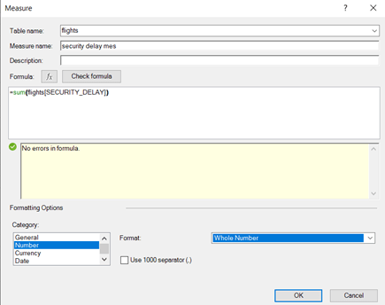
The data is downloaded into Access.

When sales_pipeline was loaded, the calculated columns year and quarter were added.

Also a new column YearQuarter was created.

A power pivot was created on the top of the data model.

Data model was created in a star schema.

Product table is connected to sales_pipeline with product fields. The sales_agent is the relation between sales_teams and sales_pipeline. Accounts table and sales_pipeline table have the common account field.

How is each sales team performing compared to the rest?

If the team manager is considered to lead a team, then sales teams are named after the manager.

Melvin Marxen is doing best.

Regional offices have close deals evenly and there are no major differences. Still, West office has the highest close value.

Are any sales agents lagging behind?

Violet McIelland is the last one when measuring with closed values.

Are there any quarter-over-quarter trends?

Second quarter was the best quarter and the first quarter lowest. 

To divide the close value percentagewise between the quarters and products:

=DIVIDE(

SUM(sales_pipeline[close_value]);

CALCULATE(SUM(sales_pipeline[close_value]); ALL(sales_pipeline[yearquarter]))

)

Product wise GTK500 sales least in Q1 but most in Q4. Deviation is higher than with other products.

The same trend can be seen with sales teams. Around 11 % of all the sales are done in Q1. Other quarters have equal sales.

Anna Snelling is selling very steadily without too much of variation. Elease Gluck sold nearly half in Q2 but only 7,7 % in Q3. Hayden Neloms’ sales covered less than 7 % in Q1 but other quarters were steady.

Do any products have better win rates?

In absolute terms, GTX Basic and MG Special have most wins.

When calculating with percentage, the differences are slight. GTX Plus Pro has the highest winning percentage.

The percents are calculated with this DAX:

=DIVIDE(

CALCULATE(COUNTROWS(sales_pipeline));

CALCULATE(COUNTROWS(sales_pipeline); ALL(sales_pipeline[deal_stage]))

)

Answers in brief.

  • How is each sales team performing compared to the rest?

Among the managers, Melvin Marxen is the first one and Dustin Brinkmann the last one.

  • Are any sales agents lagging behind?

Violet McIelland is lagging behind.

  • Are there any quarter-over-quarter trends?

Q1 is the worst and Q2 is the best, Q3 and Q4 are close to Q2.

  • Do any products have better win rates?

In absolute terms GTX Basic and proportionally GTX Plus Pro.

Three dimensional Excel sheet

You might have seen three dimensional Excel formulas.

Product one.

Product two.

Product three.

Each worksheet holds sales data by sales region and by month.

Each worksheet presents sales data per product. The reports above cover the products from one to three.

There are three dimensions: month, sales area and product. Just two dimensions, month and sales area, were presented in one worksheet.

You can create SUM functions across the three worksheets.

Total sales for North area or total sales for the month August can be calculated manually. This is not convenient for ad hoc queries.

Better way would be to have data in pivot format. Then month, region, product and sales amount should be separate columns.

For example:

Month  region   product              sales

Jan        North    P1                        23

And so on.

Add a column for the product, P1 in the sheet above, in all the three worksheets.

Take data into power query per each worksheet.

Activate the columns with header, meaning the sales areas and press right mouse button. Select unpivot only selected columns.

I added names for new column names  month, product, area and sales.

Repeat this for each worksheet P1, P2 and P3, that the sheets have the same column names in the same order.

Select append queries. The idea is to combine all the queries as one long query.

Press ok.

Import the data into data model. Create a pivot on top of data model.

The August sales is 197.

Sales for North area is 587.

When we have power query and power pivot, we can forget three dimensional worksheets.

In this example, I did not write even any DAX. It is possible to have self made measures with DAX, but it just was not needed to count total sales for August and North area.

A good thing is that the same process works also in Power BI.

My Power BI is in Finnish, but the idea is the same as in Excel.

In Power BI Aug sales is 197.

The same results in Power BI.

When a process exists in power query, you can use that both in Excel and in Power BI.

If three dimensional Excel worksheets were once used, nowadays are power query and power pivot very convenient. As said, you can use either Excel or Power BI.

Maven UK train rides

The data which is analyzed here is taken from Maven Analytics Data playground Free Data Sets & Dataset Samples | Maven Analytics . The data set is UK Train rides. Thanks for Maven Analytics for publishing the data sample. I have also answered the four questions in the data playground.

The data is downloaded into Microsoft Access. There I have used SQL queries. Then I made a data model in Excel. The Access database is the source for my data model in Excel.

  1. What are the most popular routes?

    The query:

    SELECT COUNT([Departure Station] & [Arrival Destination]), [Departure Station] & [Arrival Destination]

    FROM Railway

    GROUP BY [Departure Station] & [Arrival Destination]

    ORDER BY COUNT([Departure Station] & [Arrival Destination]) DESC;

    The same result was found with Excel.

    A route is a combination of departure station and arrival destination.

    =CALCULATE(count(Railway[Route]),ALLEXCEPT(Railway, Railway[Route]))

    The most popular route is Manchester Piccadilly – Liverpool Lime Street, the second is the route from London Euston to Birmingham New Street.

    2. What are the peak travel times?

      The query:

      SELECT COUNT([Departure Time]), [Departure Time]

      FROM Railway

      GROUP BY [Departure Time]

      ORDER BY COUNT([Departure Time]) DESC;

      In Excel the DAX is nearly the same as with the first question.

      =CALCULATE(count(Railway[Departure Time]),ALLEXCEPT(Railway, Railway[Departure Time]))

      The most popular travelling times in the morning are 6:30 and 8:00. Looks like 7:00 is not popular time at all. People are leaving for school or for work early 6:30 or bit later 8:00.

      In the evening most popular travelling times are 18:45 and 17:45. There is a difference of one hour. 18:00 is not popular time.

      3. How does revenue vary by ticket types and classes?

      The query:

      SELECT SUM(Price), [Ticket Type], [Ticket Class]

      FROM Railway

      GROUP BY [Ticket Type], [Ticket Class]

      ORDER BY SUM(Price) DESC

      With Excel, the Dax is simple. Just calculate the sum just like in Excel.

      =sum(Railway[Price])

      Standard tickets produce most of the revenue. Advance is selling best and anytime worst among the ticket types.

      4. What is the on-time performance? What are the main contributing factors?

      Query:

      SELECT COUNT([Journey Status]), [Journey Status], ROUND(COUNT(*) *100/ (SELECT count(*) FROM Railway), 1)

      FROM Railway

      GROUP BY [Journey Status];

      The same can be calculated in Dax with following sentences:

      =CALCULATE(count(Railway[Journey Status]),ALLEXCEPT(Railway, Railway[Journey Status]))

      The Dax above can be replaced by this:

      =COUNTAX(Railway, [Journey Status])

      It would be useful to have percentages also. To count the total number of values in Journal status field, we want to have following Dax:

      =CALCULATE(COUNTA(Railway[Journey Status]), ALL(Railway[Journey Status]))

      To divide first with second, we have this Dax.

      =divide([4_1_delay], [4_2_delay])

      Query:

      SELECT COUNT([Reason for Delay]), [Reason for Delay], ROUND(COUNT([Reason for Delay]) *100/ (SELECT count([Reason for Delay]) FROM Railway), 1)

      FROM Railway

      GROUP BY [Reason for Delay]

      ORDER BY COUNT([Reason for Delay]) DESC;

      To count how many times each reason for delay is appearing, we use COUNTAX Dax:

      =COUNTAX(Railway, [Reason for Delay])

      To have the total number of reason of delays, we have:

      =CALCULATE(COUNTA(Railway [Reason for Delay]), ALL(Railway [Reason for Delay]))

      To have a division we need to have DIVIDE command:

      =divide([4_5_reason],[4_6_reason])

      The most typical reason for delay is weather. The are two reason codes weather and weather conditions. The two could be summarized, then we would see that about one third of delays are due to weather.   

      I was using two tools to answer the questions in Maven Analytics playground: Access and Excel. Same answers could be found using both the tools. Data sets are useful as you can practice with the tools you like.  

      Maven Pizza place sales

      Maven Analytics published data sets about pizza sales in their website Free Data Sets & Dataset Samples | Maven Analytics . Thanks for Maven for providing data for training purposes. In this blog I am analyzing the data and answering the four questions in Maven web site.

      The data was downloaded into MS Access. As Access is a database, then the data was in a database where we can browse the data with SQL.

      Order details includes data about orders, which pizza was ordered and how many pieces. There are close to 49k records in the table.

      Order table has the order date and time. Order_id is the primary key field.

      Pizza_types 

      The primary key in this table is the first column, pizza_type_id. In the original data, the ingredients were in one column. I have separated the ingredients in different columns.

      The pizza_type table holds the prices and sizes of each pizza. The pizza_type_id is a higher level parameter. Each pizza_type_id is divided into normally three pizza_id depending on the size.

      Unfortunately, the decimals were dropped from prices. Therefore my price estimates are bit lower than real figures, but I am not that far from real figures.

      The date table is an additional table which is not part of an original data set. I will use date table in reporting, as we want to know eg. sales per each weekday.

      The data was loaded into Excel data model.

      In date table, month, week of the year, day name, and month were added.

      In Power Query a new column “hour” was added to orders table. We can use this calculated column for defining peak hours.

      This is the data model how tables are related to each other.

      Here are the relations.

      Both order_details and orders tables have order_id field. Order_detail table holds the order id, pizza id and quantity. orders table includes the ordering time. The cardinality is many to one, order_details table is per pizza and one order may include several pizzas, one order has just one order time.

      Pizzas is a pizza master data table. Order_details include which pizzas have been ordered. As said, one order my include several pizzas. Therefore each pizza needs to exist just once in master data table, before you can order the pizzas. The cardinality is one to many.

      Orders table has the ordering date. The relation is created to date table. One date may exist several times in orders table, as many orders may be placed during one day. Each date from the year 2015 exists once in data table.

      All the pizzas are listed in  pizzas table, as the pizza_types table consists of ingredients of different pizzas. Pizza_type_id is the same field in both tables. In pizza_types table pizza_type exists just once, as pizza_type is primary key in pizza_type table. In pizzas table the pizza_type_id may exist several times, as pizza_id is the primary key .

      How many customers do we have each day? Are there any peak hours?

      There are altogether 21350 orders during the year 2015. This means we have on average 58 customers a day, when we count one order as one customer. Busiest day was Nov 27th. Then we had  115 customer. Lowest number of customers, 27, was seen in Dec 29th.  

      We can see two peak hours. First peak takes place between 12-13, obviously customers are having lunch time. Another peak is during dinner time 17-18.

      How many pizzas are typically in an order? Do we have any bestsellers?

      Average number of pizzas per order is 2,3. Highest number of pizzas in one order is 28 pizzas.

      The best selling pizzas are: classic_dlx, bbq_ckn and Hawaiian.

      How much money did we make this year? Can we identify any seasonality in the sales?

      My answer for total revenue is 795200.

      The revenue was calculated with the formula below. However, when transferring the data from MS Access to Excel data model, I lost he decimals in prices. This means, my revenue is slightly lower than the correct amount.

      =SUMX(order_details,[quantity]*RELATED(pizzas[Price]))

      The best pizza, in financial terms, is The Thai Chicken Pizza.

      The total revenue was checked also in Access.

      The result is the same.

      SELECT SUM(order_details.quantity * pizzas.price)

      FROM order_details INNER JOIN pizzas ON order_details.pizza_id = pizzas.pizza_id;

      This is the SQL statement to query the total revenue.

      About seasonality in sales:

      When checking orders volumewise, meaning counting number of pizzas, the best month is July followed by May. The best weekday for pizza selling is clearly Friday. Saturday and Thursday are second best days, Saturday and Thursday have nearly equal sales but evidently lower than Friday.

      Are there any pizzas we should take of the menu, or any promotions we could leverage?

      Mushroom is the least popular.

      The other four categories are quite equally popular, but mushroom is an exception. Would it be a good idea to remove mushroom from menu ?

      There are practically no sales before 11 o’clock. Some promotion could take place to balance the workload more evenly throughout the work day.

      About the pizza sizes, S, M, and L cover nearly 99 % of all the sales. XL and XXL have portion of good 1 % out of total sales. Should the XL and XXL be removed from selection or should they be promoted ? At a moment XL and XXL do not have significance in pizza business.

      Data in several tables

      You have sales data scattered in several tables. Structure is not same from table to table.

      The first table has columns ID, product, and sales volume. The second table has columns ID, product, region, and sales volume. The third table has columns ID, product, region, sales representative and sales volume.

      Product and sales volume can be found in all the three tables. We can create a report to count sales volume per product throughout the three tables.

      Table 1.

      Table 2.

      Table 3.

      Load the tables into data model.

      Take the menu path data – get data – combine queries – append.

      Append means that we are building a table on top of another.

      Inculde all the three tables.

      For the tables without values in region or sales rep fields, the Excel enters “null”.  Region and sales rep fields cannot be used as the fields are not in every table. The common table is named as T1T2T3.

      Create a pivot on top of data model.

      Create a simple SUM formula.

      Pivot settings.

      The results.

      One way is to check with SQL in MS Access.

      SQL is here:

      SELECT product, SUM(sales)

      FROM (SELECT product, sales

      FROM t1

      UNION ALL

      SELECT product, sales

      FROM t2

      UNION ALL

      SELECT product, sales

      FROM t3

      )  AS t

      GROUP BY product;

      If you don’t need grouping by product but you would like to see just the total number. In that case just remove the GROUP BY line, and product in SELECT statements.

      If you have data bit scattered between several tables, but if the tables have common fields, it is possible to sum up the columns.

      XML data

      Sometime data you want to investigate is in XML-format. If you download data from a system and data happens to be in XML format. This blog demonstrates how you can analyze data with Excel and Access. The example data is taken from page https://www.w3schools.com/xml/cd_catalog.xml .  Thanks for organizing and providing the data.

      Here is a part of the data:

      <CATALOG>

      <CD>

      <TITLE>Empire Burlesque</TITLE>

      <ARTIST>Bob Dylan</ARTIST>

      <COUNTRY>USA</COUNTRY>

      <COMPANY>Columbia</COMPANY>

      <PRICE>10.90</PRICE>

      <YEAR>1985</YEAR>

      </CD>

      <CD>

      <TITLE>Hide your heart</TITLE>

      <ARTIST>Bonnie Tyler</ARTIST>

      <COUNTRY>UK</COUNTRY>

      <COMPANY>CBS Records</COMPANY>

      <PRICE>9.90</PRICE>

      <YEAR>1988</YEAR>

      </CD>

      <CD>

      <TITLE>Greatest Hits</TITLE>

      <ARTIST>Dolly Parton</ARTIST>

      <COUNTRY>USA</COUNTRY>

      <COMPANY>RCA</COMPANY>

      <PRICE>9.90</PRICE>

      <YEAR>1982</YEAR>

      </CD>

      <CD>

      <TITLE>Still got the blues</TITLE>

      <ARTIST>Gary Moore</ARTIST>

      <COUNTRY>UK</COUNTRY>

      <COMPANY>Virgin records</COMPANY>

      <PRICE>10.20</PRICE>

      <YEAR>1990</YEAR>

      </CD>

      XML is starting with tag <CATALOG> and end with </CATALOG> which is not visible here. Each CD starts with tag <CD> and ends with </CD>. Data fields are title, artist, country, company, price, and year. For example, title starts with tag <TITLE> and ends with </TITLE>. In each line there can be only one start and end tag or just one of those.

      Copy and paste the sample data into Notepad++. Save with extension XML.

      Data looks like this. By the way, if you don’t yet use Notepad++, I recommend that, as that holds more features than normal Notepad.

      Vertical bar on left side helps to characterize each CD.

      One way is just to take file – open and browse XML-file.

      Excel asks you how you would like to open the file.

      As an XML table.

      Press ok.

      Data is just file.

      You can also calculate from table like value of the collection is 237 units and average year is 1988.

      If you open the file with second radio button.

      Read-only workbook.

      Read only table.

      If you select source task pane, the third option.

      Press ok.

      Again press ok.

      At the right hand side, you will have XML catalog.

      Drag and drop fields from the XML source to worksheet.

      Select Developer – XML – refresh data.

      Data is brought to worksheet.

      One way to handle XML-data with Excel, is to make a data model and use XML file as data source.

      Select data – get data – from file – from XML.

      Data is organized correctly.

      Press transform data.

      Data type for price was changed for decimal number and year as whole number.

      Just create a pivot table based on the XML file.

      The total price of CD collection can be counted with a simple DAX.

      Results.

      Also the average year is counted.

      Let’s see how XML file can be used with MS Access.

      External data can be fed into Access via new data source – from file – XML file.

      Before uploading the data, I changed the decimal separator to be dot, as price is with dot.

      Data looks neat.

      Another simple query.

      The result is same as in Excel.

      Query about average year in CD collection.

      The result is same than in Excel.

      If you happen to have data in XML-format, that can be used in Excel and in Access. XML format should not be overlooked with Excel or Access. You don’t need fancy tools to analyze XML-data.  The example I used was simple and neat. Real life XML-files can be more complex and cause issues which was not seen here.

      5M rows in MS Access

      If you have a large data set consisting more than 1 M (=million) rows, it is not useful to download to Excel worksheet. You can use text file and then create a Power Query based on the text file. However, Access is my choice for storing this large data amount.

      I have downloaded data from eforexcel.com page. Thanks for organizing the sample data. I chose 5M rows of HR data.

      Create a blank database and download the data from an external source. The path is external data – new data source – from file – text file.

      Import the text file, just activate the first row containing field names. Luckily data falls under correct headers.

      In my version, I changed the decimal symbol from comma to dot. Then it is not confusing as field delimiter is comma.

      It took some time to get data loaded, but it still works. Now I have 5M records in Access in one table.

      I can still check with SQL script the total number of records.

      Different education records are here:

      Let’s see how many hits.

      Data was divided evenly.

      This is the SQL script

      SELECT educationfield, COUNT(educationfield)

      FROM 5M

      GROUP BY educationfield;

      A data model with 5M records was downloaded into Excel.

      The same results can be found in Excel too.

      Let’s make another check. Do genders differ when it comes to business travelling ?

      The business travelling is pretty evenly divided.

      SELECT gender, businesstravel, COUNT(businesstravel)

      FROM 5M

      GROUP BY gender, Businesstravel;

      If you need to make an adhoc analysis for a data with 5M records, Access is a viable choice for storing the data. The reporting was done in this example in Excel. All the data was stored in one table and no relations were needed. One thing to notice, the Access file with the data was quite big 2 GB. That is taking capacity from the hard disk.

      Cubemember and cubevalue

      You have simple sales data of sales data and product data. Sales data includes following fields: ID, product, region, rep and sales. The product data includes these fields: product, costs, price and size. The sales data is indexed by id, a separate running number. Product data is indexed by product which needs to be unique.

      We need to have a sales report per region and per product size ?

      The data was stored in MS Access.

      The product master data.

      A part of the sales transaction data.

      A data model is created in Excel.

      Let’s create also a measure to sum up the sales.

      Instead of creating a Power Pivot on top of data model, we can still extract data with CUBEMEMBER and CUBEVALUE functions.

      First, make a two-dimensional matrix. In horizontal axis we have different regions, vertically we have product size. We should fill the table with correct values. Like how many pieces of small product were sold in north region ?

      Let’s start in the cell C3. We want to extract the region attributes. The sentence in C3 is =CUBEMEMBER(“ThisWorkbookDataModel”;”[Sales].[Region].[North]”) .

      First, we define the data model. It is the data model under the Excel worksheet. Write “ThisWorkbookDataModel”. Secondly, we define the table. We have just two tables in our data model. We need to select the sales table as there we have regions north and south. After the table definition, select the field region and lastly, the value for region, north.

      Repeat the same in D3, but now the last argument is south instead of north.

      The vertical axis and the size values are created with the same logic.

      Size dimension is in prod table. The arguments are datamodel, table, column and column value.

      As we want to report the number of pieces sold, we have created the S_sale measure. The is the measure we would use in Power Pivot, and it is the measure we also use with cube functions.

      The sentence in C2 is =CUBEMEMBER(“ThisWorkbookDataModel”;”[Measures].[S_sale]”) . The first argument with CUBEMEMBER is the data model. As we use the data model under Excel workbook, just select of type “ThisWorkbookDataModel”. The second argument is the measure itself. Select of write “[Measures], press dot, and you will have list of measures. Select the S_sale.

      Now we can extract the values from data model.

      For the CUBEVALUE we need show the data model, the measure and the dimensions. The data model is “ThisWorkbookDataModel”. The absolute and semi absolute references are just to make it easy to copy the formula. Show the product size, B4, region, C3, and the measure, C2.

      The extracted values.

      Still, we will create same report in Power BI.

      Results are parallel.

      Also a query was  made in Access.

      SELECT sales.region, prod.size, SUM(sales.sales) AS Sale

      FROM sales INNER JOIN prod ON sales.product = prod.product

      GROUP BY sales.region, prod.size;

      This is the SQL script.

      The CUBEMEMBER and CUBEVALUE functions can withdraw the data from the Excel data model. If you don’t want to build Power Pivot or Power BI, you can simply use cube-functions. Of course, the result is not so graphical as with Power BI.  

      Accounting data in BI

      We have accounting data table with transactions. The transaction data includes account, debit saldo and credit saldo. We also have account master data table, which includes account and type. The type defines whether the account is income account or expense account.

      Income account increases in credit and decreases in debit. On the other hand, expense account increases in debit and decreases in credit.

      Of course, it might happen that income account holds higher saldo in debit than in credit, but then the account is in negative side.

      Reverse bookings are done when the first booking was erroneous. Therefore for income accounts debit postings must be deducted from credit postings and for expense postings credit postings from debit postings.

      First we should calculate total income and then total expense.

      The transaction data in Access.

      The account master data table.

      The simple data model.

      The measures in Power BI.

      tot_i = calculate(sum(Fill_z[C])-sum(Fill_z[D]), Acc_type[Type]=”I”)

      tot_e = calculate(sum(Fill_z[D])-sum(Fill_z[C]), Acc_type[Type]=”E”)

      The idea with measures is to CALCULATE function. First we need difference between debit and credit, or credit and debit. After the comma, comes the filtering parameter from Acc_type table. For income accounts, calculate sums of credits minus sums of debits. For expense accounts, calculate sums of debits minus sums of credits.

      The results in Power BI.

      The results can be checked in Access with SQL.

      SELECT Sum(fill_z.c)-Sum(fill_z.d) AS Expr1

      FROM fill_z

      INNER JOIN acc_type ON fill_z.acc = acc_type.acc

      WHERE acc_type.type = “I”

      SELECT Sum(fill_z.d)-Sum(fill_z.c) AS Expr1

      FROM fill_z

      INNER JOIN acc_type ON fill_z.acc = acc_type.acc

      WHERE acc_type.type = “E”

      Unpivot in Power Query

      In this blog I will demonstrate the use of unpivot functionality in Power Query.

      Here is a sales report on horizontal axis we have countries, on vertical products. Countries are divided into Europe and Asia countries. Finland and Sweden belong to Scandinavia, Germany and Spain Central Europe, China and Korea North Asia, Singapore and Indonesia South Asia. Product from P1 to P10 belong to category 1 and P11 to P20 to category 2.

      Can you make any sense with data ?

      The data is not so far readable for Pivot. The table should be narrow and tall.

      Let’s load the data into Power Query.

      The issue is still that we should have data in pivot format to analyse the data. The data should be modified before analysing.

      Activate all the countries, but not the product. Then select transform – unpivot columns.

      Now the data looks better, the data is readable for pivot. The table is narrow and long. The columns are product, country and volume.

      Just change the column names.

      Then we need to download also the master data tables for countries and products.

      As the Power Query did not recognize the first row as header, press the “use first row as header” parameter in home menu.

      Then the products:

      This is fine.

      Let’s make the relations.

      The diagram view.

      Pretty simple data model: two master data tables and one transaction table.

      The data to countries and data are products are both many to one cardinalities. Each product and country may appear just once in master data tables, but may appear many times in data table.

      A simple measure.

      Results in Power Pivot.

      North Asia is biggest sub region with sales. The category 2 equally twice higher than category one.

      Similar results are visible also in Power BI.

      Asia covers two thirds of all sales. Product category two brings more sales than one in every country.

      Geographic data in Tableau

      This blog is to test how map features are working in Tableau. The data itself is very small.

      Data consists of sales value, postal code and city.

      The cities are neighbour cities in the capital area. Postal codes situate scattered.

      Sales is a measure and code a dimension.

      The sales are reported here per postal code in text format.

      Select a map under show me from top right hand corner.

      The dots are accurately placed in the map.

      To make the map darker, select map – map layers.

      Open style drop down list and select another style for example normal.

      Now the map is more readable.

      To enlarge the dots on the map, select size under marks. Draw the parameter to right.

      The dots are larger and again easier to read.

      Also city as dimension is possible and accurate, but not as useful as per postal code.

      Map functionality in Tableau works very smoothly and is intuitive. Data in this text was vary small, but provides two geospatial dimensions.

      Accounting data in Tableau

      In this blog I test how accounting data can be reported in Tableau.

      The data itself is same as in my earlier blog posting.

      Accounts are increasing in credit. Sometimes correction postings must be made, the debit postings need to be eliminated when counting the total revenue.

      Let’s finish the theory and start Tableau.

      Connect to data.

      Change the data type of account to string, as we are not going to calculate anything with account number.

      Go to the worksheet sheet1.

      Create the calculated field in analysis – create calculated field. Add also ZN function to count the zeroes correctly.

      As stated, the income accounts are increasing in credit side. Therefore to calculate the total we need to have credit minus debit.

      Move account to rows and change it to dimension. Account is not a measure, we not counting like total of account numbers.

      Drag the tot calculated field on top of abc’s next to account numbers.

      Drag date to columns and select the lower month.

      Take the account to columns and change it to dimension.

      Select text table in the top left hand corner under show me. This not very graphical, but we can see that the numbers are correct.

      The values are now in text format. Months are in Finnish.

      Here we see the totals of the two income accounts per month. Debit postings have already been deducted.

      Change the graphics stacked bars under show me. For stacked bars Tableau advise user to have one or more dimension and one or more measure.

      To have account numbers and total balance as labels inside the bar, drag the account and calculated field tot to label under marks.

      Tableau is for data visualization. As the data here is very limited, we cannot benefit features in Tableau. The results are the same as in Power BI.

      DAX “related” function and SQL

      A database consists of master data table with product information and a transaction table with sales volumes.

      The master data table includes sales price, discount, and sales margin. The product is normally sold at sales price but sometimes discount is granted. Sales price minus costs equal to margin. The net sales equals to sales minus discount.

      The data is stored in MySQL database.

      Master data table md_prod.

      Data is very minor but the idea is to demonstrate the logic.

      I have in earlier blogs demonstrated how to report in Excel or in Power BI a data in MySQL database, therefore those parts are not included in this blog.

      First we need to count the sales in money, that is sales volume multiplied by sales volume.

      The DAX:

      =SUMX(tr_sales,[sales]* RELATED(md_prod[price]))

      This is also something I have presented in my earlier blogs.

      The results.

      Check the same from the database.

      The results are similar in MySQL. Left join was used to take all the materials from left master data table. There are no sales records for the product P2, but as the P2 is in master data table, we will take that into our report.

      To calculate the COGS we need to minus margin from sales price.

      The DAX:

      =SUMX(tr_sales,[sales]* (RELATED(md_prod[price] )))-SUMX(tr_sales,[sales]* (RELATED(md_prod[margin] )))

      Then we check from MySQL.

      The results are the same in BI and in SQL.

      The DAX:

      =SUMX(tr_sales,[sales]* ((RELATED(md_prod[price]))- (((RELATED(md_prod[price]))) *  (RELATED(md_prod[disc])))))

      I almost got lost with parentheses in DAX.

      When counting sales in money, COGS, or net sales, we took sales volume in the transaction table and material specific data in the master data table. In all three cases we used RELATED function.

      However, I felt that SQL simpler than DAX is.

      Maven Analytics 2015 New Year’s Eve resolutions tweets challenge

      Maven Analytics published the data about 2015 New Year’s Eve resolutions tweets. The data can be

      found here: https://www.mavenanalytics.io/data-playground?page=1&pageSize=5 . Thanks for Maven Analytics for providing the data.

      Also sample questions were included.

      1. What is the most popular resolution category? Least popular?
      2. Which resolution category was retweeted the most? Least?
      3. Using the tweet_created field, and rounding to the nearest hour, what was the most popular hour of day to tweet? How many resolutions were tweeted?
      4. Using a map visual, what U.S. State tweeted the highest number of NYE resolutions?

      The first, I downloaded the data to MS Access. Decimal symbol was changed to dot.

      Reporting was done in Power BI. To add the hours in Power Query, activate the tweed_created column and select add column – time – hour. Hour information is needed in question number three.

      Now the hour column appeared.

      Let’s create the needed measurements.

      Cat = count(New_years_resolutions[tweet_category])

      The cat measure counts simply the number of tweet_category items.

      FullHour = count(New_years_resolutions[Hour])

      This measure counts the full hours.

      Retw = count(New_years_resolutions[retweet_count])

      The measure counting retweets.

      States = count(New_years_resolutions[tweet_state])

      This measure counts where tweets are coming from.

      To double-check the values in Access.

      SELECT COUNT(tweet_state), tweet_state

      FROM New_years_resolutions

      GROUP BY tweet_state

      ORDER BY COUNT(tweet_state) DESC

      ;

      California is leading, New York is the second.

      Map used here is GlobeMap. The field tweet_state and measure states were selected.

      1. What is the most popular resolution category? Least popular?

      Personal growth, philantrophic.

      2. Which resolution category was retweeted the most? Least?

      Personal growth, time management.

      3. Using the tweet_created field, and rounding to the nearest hour, what was the most popular hour of day to tweet? How many resolutions were tweeted?

      9, 505.

      4. Using a map visual, what U.S. State tweeted the highest number of NYE resolutions?

      California.

      Sales postings higher than 1000 in MySQL

      You have accounting data. Both accounts 1000 and 2000 are revenue accounts. Each posting is a sales order. Debit postings are correction postings.

      A controller is interested to know how many sales orders have been made valuing more than 1000 units. As the sales orders higher than 1000 are high value sales orders.

      How many percent of the total sales, the sales order more than 1000, cover ?

      Correction postings should be removed when calculating the total sales.

      A sales order for 1067 was originally posted for account 2000 and cost center C2. That posting has been reversed and a correct posting was assigned to account 2000 and cost center C1. There is only one sales order for 1067.

      Let’s create a table in MySQL.

      The fields are:

      ID running number primary key to define each record individually.

      ACC bookkeeping account.

      CC cost center.

      DEB debit postings.

      CRE credit posting.

      CREATE TABLE excel_demo.onek(

      id INT PRIMARY KEY NOT NULL AUTO_INCREMENT,

      acc TEXT,

      cc TEXT,

      deb INTEGER,

      cre INTEGER

      );

      Before importing data you need to fill zeros to empty debit and credit cells.

      Activate the value fields, take home – find & select – go to special.

      Select blanks. Ok.

      Enter zero and press control + enter.

      All the empty value fields are populated by zero.

      Now we can import the CSV-file to the MySQL table.

      Map the correct source and destination columns.

      Everything went fine. Data amount was small.

      Check that the table has been populated with values.

      ID field has values automatically. They were not in flat file.

      Connect to the MySQL database.

      Select get data – from database – from MySQL database

      Press ok.

      Transform data.

      Data types are ok. Table name was shortened to onek.

      Close & Load – Close & Load to

      Only create connection and add this data to the data model.

      =CALCULATE(count(onek[Cre]),FILTER(onek,[Cre]>1000))-CALCULATE(count(onek[Deb]),FILTER(onek,[deb]>1000))

      The measure is counting records Cre-fields in onek table where Cre-fields have value more than 1000. Corresponding debit values are decreased from credit values. As 1000 and  2000 are revenue accounts, they get increased in credit side.

      Add measure.

      =CALCULATE(SUM(onek[Cre]),FILTER(onek,[Cre]>1000))-CALCULATE(SUM(onek[Deb]),FILTER(onek,[deb]>1000))

      Total_val counts the sum of the sales order more than 1000 units.

      =sum(onek[cre])-sum(onek[deb])

      Sum_val counts simply the sum of credit postings minus sum of debit postings.

      To count how many percent of value are the sales orders exceeding 1000:

      Now we create the pivot itself.

      Create pivot table based on data model.

      Cost centers are on vertical and accounts on horizontal axis. No sales order above 1000 in cost center C2, all of them are in C1. Altogether four sales orders two sits in account 1000 and two in 2000.

      Now to calculate the total value of sales order exceeding 1000 units.

      In the account 1000 the sales order exceeding 1000 cover more than a third of sales in value. The proportion of large sales orders are considerably lower in account 2000.

      All the sales order more than 1000 units are in cost center CC1 and none in CC2.

      We can check same in Power BI.

      Get data from MySQL database.

      Similar to Excel.

      Transform data.

      Again similar to Excel.

      DAX is similar to Excel.

      In cost center C2 there are two sales lines exceeding 1000 in both accounts 1000 and 2000.

      The other measures behave similarly in Power BI. I am not creating all the measures in Power BI, but they all work equally.

      Let’s still check something from database, that the number are correct.

      SELECT

      ((SELECT COUNT(excel_demo.onek.cre)

      FROM excel_demo.onek

      WHERE excel_demo.onek.cre > 1000)

      (SELECT COUNT(excel_demo.onek.deb)

      FROM excel_demo.onek

      WHERE excel_demo.onek.deb > 1000)) AS total

      ;

      The total number of sales order exceeding 1000 is four.

      SELECT 

      ((SELECT SUM(excel_demo.onek.cre)

      FROM excel_demo.onek)

      (SELECT  SUM(excel_demo.onek.deb)

      FROM excel_demo.onek)) AS value

      ;

      This SQL count the total sales. The 16282 ties with Excel.

      Maven marketing challenge

      Maven Analytics published a marketing challenge https://www.mavenanalytics.io/blog/maven-marketing-challenge a campaign data with appr. 2200 records of marketing data.

      The task is to pitch one recommendation to improve future marketing campaigns.

      The data can be found here https://www.mavenanalytics.io/data-playground . Thanks for Maven Analytics for providing the data.

      My view is more to find some conclusions rather than providing graphics.

      The data looks like this:

      Also the data dictionary was attached.

      I downloaded the data to Access database. The reason for using Access is to have data in a database.

      The data was loaded from Excel. Select external data – new data source – from file – Excel.

      The data in Access.

      The data is driven to data model. Some data types were changed from decimal to whole number.

      Only create connection and add this data to the data model.

      Business as usual.

      Then we can start creating measures.

      All the accepted campaigns were added to one number. We are not analysing single campaigns but all the campaigns are considered as one value.

      Check the accepted campaigns per country.

      Spain is the main country. Out of eight countries more than half of all accepted campaigns were accepted in Spain. That is the country we are concentrating on.

      Create a measure to calculate all the accepted campaigns.

      Count percentage.

      53 % of all all the accepted campaigns took place in Spain. That is the country to concentrate on.

      Birth years are scattered between 1893 and 1996. To analyze the data we need to group the data into buckets. If sentence below groups the birth year per decade.

      = Table.AddColumn(#”Changed Type”, “Year_birth_cust”, each if [Year_Birth] < 1950 then 40

      else if [Year_Birth] < 1960 then 50

      else if [Year_Birth] < 1970 then 60

      else if [Year_Birth] < 1980 then 70

      else if [Year_Birth] < 1990 then 80

      else 90)

      A calculated column is added Power Query.

      The customers born on seventies have accepted campaigns. This report is without filters.

      In Spain those born in seventies have highest acceptance ratio.

      Let’s check another parameter, amount spent on sweets.

      On Access you can use SQL script eg. to see the lowest and highest value for amount spent for sweets.

      Values are scattered between 0 and 263 some groups are needed to analyse the parameter.

      if [MntSweetProducts] < 50 then 1

      else if [MntSweetProducts] < 100 then 2

      else if [MntSweetProducts] < 150 then 3

      else if [MntSweetProducts] < 200 then 4

      else 5

      Again a calculated column is added to Power Query.

      Persons not eating too much sweets have accepted a most of campaigns. Those who have spent more than 200 for the sweets have not accepted any single campaigns. This is very clear indicator that campaigns should be targeted for those who do not spent too much money on sweets.

      The parameters could be reviewed in similar way further. I just added age and amount spent on sugar as examples.

      To pitch one recommendation for future campaigns, that was the task given.

      My pitch is concentrate on the persons who

      • Those who live in Spain.
      • Born in seventies.
      • Not eating too much sweets.
      • Education graduation, master or PhD.
      • Marriage status: married, single, together.
      • No kids at home.
      • 0 or 1 teen at home.
      • Not eating too much meat.
      • Not eating too much fish.
      • Not spending too much in gold.
      • Not making too many deals purchases.
      • Not making too many web purchases.

      More dimensions can be found of course. Here is one list.

      BI reporting from MySQL database

      In this blog page I will show how I get reporting from MySQL database.

      It is possible that there are other ways to get reporting too. This is just how I did it.

      To start with, you have a simple sales report.

      The dimensions are running ID number, material code, sales region and sales volume.

      We could simply use the Excel as source of data for our data model. Instead of copy pasting the data to Excel, we use MySQL database.

      Create a database and a table corresponding to data in the report.

      Right-click the table and select table data import wizard.

      Select the database table.

      The fields in the file are mapped with fields in the empty table.

      Now the table is populated. A good thing with SQL database, is that we can check the database with an SQL script. Note, that the database is called excel_demo.

      Now we should have connection with database and Excel to get reporting done in Excel.

      https://dev.mysql.com/downloads/connector/odbc/

      I downloaded here the open database connector.

      This is how the page looked like for me.

      Search for ODBC data sources.

      Press add.

      Add the excel_demo database.

      Select MySQL ANSI driver and press finish.

      Data source is our database. TCP/IP and port are fixed values.

      Press test.

      The test was successful.

      Excel_demo appeared to the list.

      Now we can open Excel and start working on reporting side.

      In Excel take data – get data – from other sources – from ODBC.

      Select excel_demo from the dropdown list. Click OK.

      Select database from left hand side. Enter the user name and password. Press connect.

      All the available databases in MySQL are visible. We are interested in excel_demo.

      Press transform data.

      Check the data and data types for fields.

      Close & Load – Close & Load To

      Only create connection and add this data to the data model.

      Create a measurement to sum up the sales volumes.

      Sales per region.

      Let’s check the data in MySQL.

      The values match.

      Another option is to use data directly from MySQL database without ODBC.

      Select get data – from database – from MySQL dataset.

      Localhost as server and excel_demo as database.

      Transfrom data.

      Close & Load – Close & Load to.

      Only create connection and add this data to the data model.

      Now the table name is database name + table name.

      Creating a measure to sum up the sales volume.

      The process is pretty similar in Power BI side, too.

      Connection between Excel/Power BI and MySQL can be done via both ODBC and directly to database.

      An advantage with MySQL is that you can paste data with CSV-files to MySQL tables. When you have the data in MySQL, the data can be manipulated and reviewed with SQL script. Still, the reporting can be done in Excel or in Power BI.

      After the connection is in place, we can briefly analyse data.

      Even though the sales were divided quite evenly between the regions, there are differences per product. None of the products are sold evenly between the regions. Also volumes per per product are varying between 9 and 45.

      Accounting data in BI reporting 2

      This blog post is an extension to my earlier blog post about accounting data in BI reporting.

      Here is some accounting data. Accounts starting with three are income accounts increasing value in credit and accounts starting with four cost accounts increasing value in debit side.

      The dimensions are account, cost center, date, credit value and debit value.

      It would be useful to see profit and loss dynamically per cost center or per time dimension like month.

      Create sum measure to count debit balance.

      Summing the credit side.

      These measures do not take yet correction postings into consideration. Account 3000 should be 2282 minus 250.

      Sum debit total is sum debit minus sum credit.

      Sum credit total is sum credit minus sum debit.

      Now the balance for 3000 is 2032 in credit, but -2032 in debit should be removed.

      Create an if sentence. IF sentence in DAX is pretty similar as in traditional Excel. If sum debit minus sum credit is positive, then count normally sum debit minus sum credit. If sum debit minus sum credit is negative, then the formula returns zero value. Separator is comma not semicolon.

      The same operation for credit side as for the debit.

      Now the results are as they should be.

      The selections.

      Adding the cost center.

      This looks better but cost center totals are missing.

      Then select subtotals – show all subtotals at bottom of group.

      The highest profit was made in cost center S2.

      Same measures can be created to BI also.

      For me Excel work better in this case.

      BI reporting from SQLite database

      In this blog I will demo, how you can take reports in Excel or in Power BI, when the data is in a self made database. The database is simplified just to demo how you can report the data with Excel.

      The editor I am using is SQLite3.

      The table “sales” includes sales data, product and volume. The sales table is a transaction table.

      The product table includes basic data of the product. This is like product master data.

      In order to get SQLlite connected with Excel and Power BI, you need to download the connector from http://www.ch-werner.de/sqliteodbc and there sqliteodbc_w64.exe.

      In ODBC admin press add.

      Take the SQLite3 ODBC driver and press finish.

      Browse your database and give a name.

      Press OK.

      In Excel take data – get data – from other source – from ODBC.

      Open up the drop down list and select sales_demo.

      Press ok.

      Select windows and use my currect credentials. Press connect.

      Select multiple items and select both the tables. Then press transform data.

      Price in prod table was changed to be integer.

      Also the sales volume is the data type of integer.

      The data in Power Query is same as in SQLite3, as it should be.

      Close & load – close & load to.

      Only create connection and add this data to the Data model.

      Take Power Pivot and Datamodel.

      Diagram view.

      Create a minor data model.

      Take pivot table that takes the data from data model.

      Use the Data model as the basis for the Pivot.

      Let’s create a measure to sum the sales.

      Select size as rows and sum of sales as values.

      The total 121 is divided 101 large products and 20 small ones.

      To calculate the sales in money, we will use SUMX and RELATED functions.

      The formula is here: =sumx(sales,sales[vol]*RELATED(prod[price]))

      Results in Excel.

      The same process in Power BI:

      Get ODBC, then connect.

      Sales_demo press ok.

      Connect.

      Tick the tables and press transform data.

      Change data type for price as integer.

      Also change data type for vol to integer.

      Close & apply – close & apply.

      Power BI created the relation automatically, unlike Excel.

      Create measure for summing the sales.

      Create another measure just like in Excel.

      Results in Power BI.

      Doublecheck the results from database directly.

      Sales volume by size.

      Sales in money by size.

      If you have data in a self-made database, it is possible in some cases to use Excel or Power BI for reporting.  Connector is needed but in this case, the connector was available on line. The same connector work for both Excel and Power BI.

      Even though SQLite is not listed in Excel or in Power BI as a source of data, but via ODBC you can access SQLite database.

      Once more, Power BI visualize the data instead of writing SQL scripts in editor even though the results are same both in database and in Power BI.

      Weekday in BI reporting

      A sales report is downloaded from ERP. The dimensions are sales date, product and sales volume.

      Does the weekday play a part in sales ? Are the sales for a product different between different weekdays ? Is one day in week more favourable for sales than another one ?

      We can do this in several ways.

      1. Traditional pivot

      If we use traditional Pivot which sits on top of Excel range, we just add weekday next to sales volume. Weekday is defined by the date.

      Earlier in my blog I was presenting the IF-sentence which returns you a weekday based on the WEEKDAY function.

      =IF(WEEKDAY(a2)=1;”Sunday”;IF(WEEKDAY(a2)=2;”Monday”;IF(WEEKDAY(a2)=3;”Tuesday”;IF(WEEKDAY(a2)=4;”Wednesday”;IF(WEEKDAY(a2)=5;”Thursday”;IF(WEEKDAY(a2)=6;”Friday”;IF(WEEKDAY(a2)=7;”Saturday”)))))))

      Create a Pivot based on the range.

      Pivot selections.

      The results. Weekend is a good time for sales. Friday is still ok, but Monday is really quite day.

      2. The weekdays in Power query

      However, we can do the same in business intelligence side.

      First, we need to download the file to data model.

      Transform data.

      Close & Load To

      Change the date column to date data type.

      Add column – date – day – name of day.

      Errors appeared.

      Select the query options.

      Change to Finnish.

      Close & Load.

      Now the days are ok, at least with me.

      Select Add column – custom column.

      The formula:

      Date.DayOfWeekName([Date])

      The columns are the same.

      Create a pivot based on the data model.

      Selections.

      Results not yet sorted.

      Different selections.

      The same results.

      3. Weekday in Power Pivot

      Add new column with script below.

      =if(WEEKDAY([Date];1)=1;”Sunday”;if(weekday([Date];1)=2;”Monday”; if(weekday([Date];1)=3;”Tuesday”; if(weekday([Date];1)=4;”Wednesday”; if(weekday([Date];1)=5;”Thursday”; if(weekday([Date];1)=6;”Friday”; if(weekday([Date];1)=7;”Saturday”;”Else”)))))))

      Selection criterias.

      Results in English.

      4. Let’s see how the weekdays get reported in Power BI. The dates are in a separate table.

      File – get data – text/CSV. To load the flat file.

      Press transform data.

      The table name was changed.

      Select close & apply – close & apply.

      Upload the data again, but now upload just the dates. Delete the product and sales volume data by home – remove columns.

      Right click the date column header and select remove duplicates.

      Select add column – date – day – name of day.

      Weekdays appear in Finnish.

      If you want to modify the day names, there is also another option.

      Select add column – day – day of week.

      Day of week returns a number. 6 is Sunday, 0 is Monday, 1 is Tuesday and so on.

      Then select add column –  conditional Column.

      Fill the IF-sentences via graphical interface. If Day of week (number) equals to 6 then Day short column holds the value Sun and so on.

      You can name the days in your own way, I have used here the shortened values.

      Close & apply.

      Create a simple data model.

      Cardinality is one in master data table and many in transaction table.

      Create a measure to count the sales.

      Sunday is the best sales day, Tuesday the worst. This is in line with Excel reports.

      There are many ways to report sales by weekday. Power BI offers graphical tools for several purposes. Also having a data model with transaction table and master data table is useful. Among the options I have demonstrated, I vote for Power BI.

      Accounting data in BI reporting

      In this blog I present how to report accounting data in Power Pivot and Power BI.

      Accounts 500 and 501 are revenue accounts and they get increased in credit side. However, some mistakes were corrected with debit postings.

      When reporting the revenue, the debits should be deducted from credit.

      The total revenue is 380.

      However, if you want to report dynamically by month or by account, it’s better to call up Power Pivot and Power BI.

      Get the data to the Power Query.

      Transform data.

      As the date is in Finnish format, take options and file – settings – query options.

      Change regional settings to Finnish.

      Change data type for date column as date. Data type for account was changed to text as we have no plans to execute any calculations based on account number. Debit and credit should be number type because they are used in measures.

      File – Close & Load to…

      Only create connection and add this data to the data model.

      A measure to sum up the debit postings.

      Another measure for the credits.

      The total measure to count the net postings, meaning credits minus debits.

      Select totals per account.

      The results in Excel.

      Let’s do the same in Power BI, in case you prefer using Power BI.

      Get data – CSV.

      Transform data.

      Change data type for account as text. No plans to use account as numeric data.

      Add calculated column Date – month – month.

      Close & Apply.

      Then we create measure just like in Power Pivot.

      Sum for debit side.

      Sum for credit side.

      Totals are counted credit minus debit as revenue increases in credit side.

      The results are the same as in Excel. Power BI is presenting the results more graphically than Excel.

      MS Access as a source of data for Power Pivot and Power BI

      In this blog page I show how an Access database can be used as source of data for Excel Power Pivot or Power BI.

      The Access database table consists of three fields: indexed ID field, product and sales volume.

      The table is shown here is design view. ID is the field with primary key.

      For the product-field a validation rule is set that only validated values for the fields are P1, P2 and P3.

      In Excel select data – get data -from database – from Microsoft Access Database.

      Access database is a ready made option as a source type for Excel.

      Transform data.

      Data type for ID field was changed to text as we have no plans to execute any calculations with ID field.

      Take close & load – close & load to.

      Create a measure to count total sales volume.

      Create a pivot on top of data model.

      Let’s create a graph based on data.

      The access table was updated with few extra lines, the table was saved.

      In Excel side, take power pivot – analyse – refresh.

      Sales for P1 increased.

      In Power BI select get data – access database.

      Access database is, like in Excel, a standard data source type for Power BI.

      Transform data. Just like in Excel.

      ID data type was changed to text.

      Select close & apply – close & apply.

      Tot_sales = sum(Sales_t[Sales_vol])

      Create a visualization.

      Choose dimensions.

      The results.

      Now let’s change the Access data table.

      The sales have been boosted for the product P2.

      Fresh the data in Power BI.

      The sales report by controller has been updated.

      The point in this blog is that Access database is a very suitable source for both Power Pivot and Power BI. A benefit with Access is that data and report are separated. Data is not just a csv file, which was loaded from a system. If csv should be updated, then a new csv file should be taken from the source system.

      Once the connection between the Access and reporting has been established, Access can be handled and updated via Access interface and at the same time reporting can be taken elsewhere.  

      Geographic data with power pivot and power bi

      In this blog, I will check how easily geographic data can be handled in Power Bi compared to Excel.

      Let’s have sales report with geographic data divided to four tables.

      Tables are loaded to data model.

      Tr_ord is the only transaction table with dimensions of order number, customer, product and sales quantity. Order number was changed to text as we don’t plan calculate anything with order number.

      Customer master md_cust defines customer code, customer’s country and customer class large or small.

      Product master data includes product code, name and sell price.

      Continent based on customer’s country.

      Data model is straightforward.

      Relationships:

      Creating the measures.

      A simple measure to count order quantity.

      DAX: = SUM(tr_ord[Quan])

      A measure to multiply sales quantity of a material by corresponding material price.

      DAX is here for copy pasting:

      =sumx(tr_ord,[Quan]*RELATED(md_prod[Price]))

      For the customer in Singapore two pieces of P3 and two pieces of P4 were sold. Price for P3 is 2,5 € and P4 is 2 €.

      Pivot table selections.

      This report has correct values but it could be more visual.

      One option is to use Power BI.

      Power query in Power BI looks similar to Power query in Excel.

      Power BI created relationships automatically.

      Relationships are same as in Excel even though interface is bit different.

      The DAX is the same as in Excel, again interface is slightly different.

      We add a visualization.

      A multi-row card to check values.

      Select the fields country from md_cust and measure sum in sales quan.

      Select country from md_cust and measure sales in money in tr_ord.

      The values are same as in Excel.

      Select the map.

      Select now sales quantity measure.

      The map visualizes much better than a table. The bigger the ball is, the higher the sales are in that country.

      Now select the filled map.

      Filled map tells us where the markets are, meaning where are your customers. Unfortunately, Singapore is not visible.

      You must see the difference if you compare this to Excel. Excel is not a bad tool at all, but Power BI is made to visualize data. Even a minor example clarifies the case. A good thing was, that you don’t have to customize the maps at all, just add visualization and select fields to be reported. Power BI reads directly the report with country names.

      Graphs with power pivot

      This blog is to demonstrate how to make a somewhat interactive graphs with Power Pivot.

      First, we have data in a sales report in CSV format. Report consists of 120 lines and five different dimensions. Descriptive dimensions are product, region and sales rep. The value dimensions are sales value and margin.

      CSV-data is checked with notepad.

      We need to upload the data to the data model, as usual.

      Data type for rep was changed from number to text. Even though the rep is a number, but we won’t do any calculations with rep, so it is better to change the rep as text. Other than that, this looks good.

      A short sales report is now in data model.

      A pivot uses the workbook’s data model.

      Measure created for total sales.

      A measure for the margin.

      Sales and margin per sales rep.

      Absolute figures are good, but also relative values should be visible to see the margin percentage per sales representative.

      A measure to calculate margin percentage simply by dividing margin by sales volume.

      Total sales and margin %.

      A graph is needed to visualize the absolute sales volume and margin percentage.

      Let’s take a bar chart.

      This does not look good. The margin percentage is compared to absolute sales volumes.

      Click the mouse in the middle of the chart, that you get frames around the chart. Then right click the mouse and select change chart type.

      Select combo at the lower left hand corner. Check that chart type for Margin % Mes is line and activate the secondary axis for the margin percentage.

      Now the graph looks better. The scale for the sales is on the left, and another scale for margin is on the right.

      It is obvious based on the graph, that rep number three is selling lowest volume but the margin percentage is double compared to other reps.

      Sales rep in column was changed to region.

      The Pivot got updated automatically.

      The graph is updated. Region West is selling far more in value than other regions. The margin percentage is clearly the highest among the regions.

      Another option is just to take Total sales per sales rep and count how many percent eg. Sales rep 1 is selling out of the total sales. In this case it would be 887/3878 which equals to roughly 23 %. But it is better to count that dynamically with a measure.

      Let’s create a measure to have total sales 3878 as a parameter.

      Calculate with CALCULATE, first argument is the Total sales measure, then use ALL, to count ALL in Sales report table.

      Having Total sales mes and All sales mes in value field. All sales mes shows the same figure as grand total for the Total sales mes. All sales mes indiciates the value for each line.

      Divide Total sales measure with newly created All sales measure to get the relative value.

      The All sales mes -measure is not needed in the screen but it is a background value for the Sales % total mes.

      Just remove the Total sales Mes as it is not needed in the graph. Sales rep 1 sold close to 23 % of total sales as we calculated manually. Now the value is dynamically calculated with a measure.

      Select insert – charts – doughnut.

      Would be nice to see the percentages.

      Activate the graph, select add chart element – data labels – show.

      Sales rep 1 sold the most and is the only one exceeding 20 % limit.

      Change the rep to region as the row parameter.

      Then we will see in the report how the total sales were divided between different regions.

      The graph got updated automatically. West is selling nearly half of the total turnover.

      The sales data we have is tiny. Still taking the sales data to data model, enables us to have graphs updated automatically once we take different dimensions to the power pivot.

      Nearly 6 million rows of data with Excel

      How does Excel perform with millions of rows of data ? Is it possible to tackle a report of millions of rows with Excel and a normal laptop ?

      The hardware I am using to handle the data is Intel core i5-6200 CPU @ 2,30 GHz and 6 GB of ram. The hard disk is a solid state drive.

      I downloaded data from this page https://www.mavenanalytics.io/data-playground . Thanks for Maven Analytics for providing this data.

      Let’s test.

      Download the data first to your hard drive.

      Then get data to your data model.

      When loading the data, it is useful to check the headers. If Power query has not defined the headers correctly, press “Use first row as headers” in home -transform.

      It took around six minutes to download the flight data, close to 6 M records, to the data model from hard disk. This means around one million records in a minute.

      One transaction table and three lookup tables. Only the flights transaction table is massive.

      Relationships.

      Relationships in diagram view.

      Create a pivot sitting on top of the data model.

      Create a measure.

      Summing the security delays.

      Pivot selections.

      The results.

      The idea of this blog text was to test briefly how Excel with a normal laptop could handle millions of rows of data. Uploading the large table to data model took time, but once that was done, the rest went smoothly. Power Query and Power Pivot are scalable products which can handle reasonable large data amounts.

      If you want to analyze a large data temporarily, Excel can do it according to my test. This test was not to play around with data, but just make short sample to see if tools and hardware can take the load.

      Several source files in Power Pivot

      You have data in several text files, altogether three reports, each of them contains 100 lines. The structure is the same in all the three reports: sales representative, product and sales volume.

      Note, that the data is in line with header row, even though file looks bit skewed.

      What is the total sales volume for each product ?

      We could find this out by copy pasting three reports into one Excel sheet and placing pivot on top of the combined sheet.

      However, sales volume by product can be calculated with power pivot.

      First, we need add them all to worksheet’s data model.

      As the files are in one folder C:\BI, we can transfer the whole folder to data model.

      Select data – get data – from file – from folder.

      Browse the correct path.

      Press Transform data.

      The combined files are listed.

      Press combine files -button with two arrows downwards in content column.

      Looks ok, press ok.

      All 300 lines are included.

      Select Close & Load – Close & Load to.

      Select only create connection and activate add this data to the data model. Press ok.

      The queries and connections. Also BI-folder with 300 records is included.

      If you don’t see this box, select data – queries & connections.

      Select  Power Pivot – Manage to see the data model.

      Data is there.

      Before we dive into Power Pivot, we could create a measure for the sum of sales.

      DAX is short =sum(BI[Sales]) . Format is whole number as sales is not a decimal number.

      Time for pivot: take insert – pivot table.

      We use worksheet’s data model as the source data.

      Source.Name is a new field, which is the file name either one.txt, two.txt or three.txt. Take product as rows and sales total as values.

      The result.

      Of course, you can append text files manually, and then run normal pivot.

      Append manually three files into one.

      Use the range as the source data.

      The result is the same with traditional pivot.

      Combining files from folder into data model took more time than traditional pivot. If you had twenty text files each containing 10000 rows, that would take long time to combine all manually. Also manual process increases the possibility for human error.

      Data model makes it possible to create relationships between tables and expand report.

      If you can download the data with separate files with same structure, it is not an issue for power pivot reporting.

      Simple sales report to data model

      You have downloaded a simple sales report from ERP.

      The report includes product data, region, sales representative, sales amount and margin.

      You could easily create a Pivot table using the range A1:E28 as source data.

      Another option is to create a table and add the table to data model.

      Activate the range manually or control + A. Then select insert – table or press control + T.

      Press ok. Check that My table has headers tick box is activated,  as the first row includes header information.

      Layout changed a bit, when table was created based on the range.

      Choose power pivot – add to data model.

      Data is now in Power pivot data model.

      Table name was changed to more descriptive Tr sales. Tr stands for transactions.

      Create a pivot based on workbook’s data model. The traditional pivot would be used when selecting the first radio button, now we use workbook’s data model as source data for pivot.

      Report the margin per sales rep based on data model.

      The results.

      This could have been done with normal Pivot, too.

      However, both products and sales reps are just codes in the transaction table. To make report more informative, codes could be replaced by real names.

      Master data table for sales reps. Table includes name, day for starting the employment and boss’s name.

      Make the table by activating the area and pressing control + T. Then press ok. Select Power Pivot – add to data model. Table name was changed to md_rep.

      Note that the data is imaginative.

      Master data table for products include product name, size of the product and product division.

      Table was made also from the product table. Table name is md_prod.

      Relationships in data model. Tr sales-product and Tr sales-rep are foreign keys in transaction table. Corresponding primary keys in master data tables area md_rep-rep and md_prod-product.

      Cardinality is many in transaction table and one in master data tables.

      Now we can start actual reporting.

      To see how two sales teams have been doing by product division. Remember to select all the tables, not only active ones.

      If you pivot field selection looks different, press

      and select Field section area section side-by-side.

      A calculated column created to count the margin percentage.

      It took more time to transfer the report and the data to data model than using the traditional pivot table. However, data model creates basis for more business intelligence type reporting. Once master data is in place, you can use those with other transaction tables. Data model gives you countless number of possibilities to understand the data. Only few examples were shown here.

      Locale parameter in power query

      Please note, that this issue took place in power query editor, not in Excel application side.

      Product and price rows are of text type. Price should be numeric field, that calculations could be carried out with price row.

      After changing the row to decimal number, the row shows an error.

      This issue can be tackled with query options.

      Select file – options and settings – query options.

      Take regional settings – locale.

      As the decimal separator was a dot, the local settings should be changed to English.

      Now the data type can be changed.