CUMPRINC and CUMIPMT are less familiar financial functions compared to PMT, IPMT and PPMT, at least for me.
Let’s revise PMT, IPMT and PPMT first.
If you borrow 10 000 from a bank, interest is 4 % a year and your payback time is three years, then your monthly payment to the bank is 295,24. This we can calculate with PMT function.
PMT function returns a negative value, therefore I use minus with function. For me, it makes more sense to have a positive value. PMT holds three arguments: interest, number of periods and debt capital. As we calculate monthly payment, I divided interest by twelve and multiplied number of periods by twelve.
The monthly payment is divided into interest and principal.
Payment is 295,24 each month, but division between interest and principal is changing. At the start, interest is high and principal is low. At the start, relatively high part of payment is used for paying interest. Then paying the principal back to bank is correspondingly low. When time goes by, proportion of interest is decreasing, and higher part of principal will be paid back to the bank. IPMT defines the interest for each payment and PPMT the amount of principal.
CUMPRINC and CUMIPMT functions are used if you want to calculate how much either principal or interest you have paid during certain periods during payback time.
For example, during the first year, you will pay interest for 341,74 and principal 3201,14. As you see, I have simply calculated with SUM function. 341,74 plus 3201,14 is equal to 295,24 multiplied by 12.
Same value can be calculated with CUMPRINC and CUMIPMT.
CUMPRINC and CUMIPMT functions have the same arguments:
Rate, as we calculate monthly values, the rate is C3/12.
Number of payment periods, that is D3*12, 36 months.
Present value, debt capital B3.
Start period, from which period do we calculate principal or interest.
End period, till which period do we calculate principal or interest.
Type, is the payment at start of the month or at the end of the month. I have the payment at the end of the month, the value is 0.
CUMPRINC and CUMIPMT can be useful functions when you calculate the cumulative principle and income. However, it is useful to revise financial functions PMT, IPMT and PPMT before using CUMPRINC and CUMIPMT.
Please note that the values Excel is calculating might be slightly different than numbers from your bank. The use of calculating financial functions in Excel to have another view to loan calculations in addition to what your bank says.
The countries are ranked in order based on the medals the country has won in races. The best country has won more gold medals than other countries. The countries which did not win any gold medals are ranked based on how many silver medals they got. The countries which did not win any gold or silver medals are listed by the number of their bronze medals.
If country won one gold medal is that country ranked higher than a country which won 10 silver medals but no gold medals.
G, S and B stand for gold, silver and bronze, just for clarification.
We need to create a reference number for all the countries, the reference number depends on the number of medals the country achieved.
The number of gold medals is multiplied by 1000 and number of silver medals by 100. Then number of bronze medals is added.
Country A won nine gold medals, six silver medals and eight gold medals. Therefore, the reference number for the country A is 8 * 1000 + 6 * 100 + 8= 9608.
Then we can rank the countries, so that number one is the best country.
In our case, function RANK.EQ holds just two arguments. Number, which is ranked, and reference numbers to which the number is compared. The third argument, order, is also possible. In this case, it is not needed. If we wanted to rank the last country as one, we would just enter 1 as order.
Finally, we could set up a podium. We mark 1, 2, and 3. Then Excel should look for us to decide which country is the first, second or third.
For that, we need two functions INDEX and MATCH. I will introduce the functions.
For INDEX the area B2:E4 is defined first. Row selection is three, meaning we take the third row in the area, meaning row starting with nine. Column selection two means that we take the second value from that row, that is ten.
We have lookup value in B2 and lookup array from B4 to B8. Match type is zero, we are looking for the exact match, sharp two. The number two is the fourth number is the array.
First, we need to use MATCH function to find out that number one is the third number in I4:I13 array. Then we take the third country from C4:C14.
A company of changing chart of account and the system how the book keeping accounts are numbered. Earlier the accounts consisted of four digits. Now all the accounts will have five digits. An extra zero will be added between the first and second digit. For example, 1320 will be 10320 and 1090 will be 10090. How can we automate the change with Excel ?
=LEFT(B4;1)&$B$2&(RIGHT(B4;(LEN(B4)-1)))
First we need to take one digit from the left with LEFT(B4;1). The with &$B$2& we add the zero from B2. I have taken zero as reference, if the second digits should be something else than zero, then update the B2 cell. The rest RIGHT(B4;(LEN(B4)-1))) takes digits from right. We are taking three digits as the length of account is four digits and we subtracted one. I did not want to define the number of characters for RIGHT function with static three, as now the sentence works also with numbers longer or shorter than four digits.
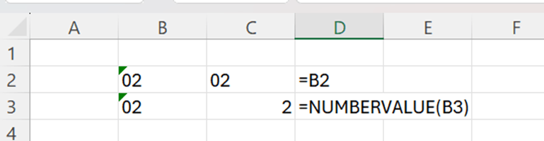
The result is correct, but you noticed that numbers aligned to left. Therefore, the values are not numbers. If you need to calculate anything, the cell values should be numbers. As values look like numbers, it would be better that cell category is number.
Only NUMBERVALUE function is added, and the results are in numeric value. The results are aligned to right.
Now we have correct account number. Next task is to find account descriptions from the old account numbers and match them with the new account numbers.
This we can do with VLOOKUP. As we know, VLOOKUP consists of four arguments:
Lookup value, which value we are looking for.
Table array, where the value is being looked for
Column index number, as the value was found in most left column, at which column the value is captured.
Range lookup, we are looking for the exact match for lookup value.
The key in our case is that lookup value may be formed with formulas.
The cell E4 holds the value for 10000, that is the new number for 1000 cash account. We need to have the description for the account 1000 to 10000. The cell value of 10000 needs to be converted to lookup value 1000.
NUMBERVALUE(LEFT(E4;1)&RIGHT(B4;LEN(E4)-2))
We need to take one value from left and then from right the length of the cell subtracted by two. The result needs to be converted into number value. That is how we get 1000 from 10000.
In B and C columns we have old accounts and descriptions. In E columns we have accounts with new numbering, an extra zero has been added between 1st and 2nd number. The description from the old accounts is fetched with VLOOKUP to the new account numbers. Now we have the new chart of accounts in use.
We have data only in PDF format. Both Excel and Power BI list PDF as a possible data source type.
PDF is listed in Excel,
and also in Power BI.
Now the data is in PDF file, only.
Excel can read the PDF correctly.
Data types are automatically correct in Power Query.
Results in Excel after a pivot was created.
The PDF data load into Power BI is similar to Excel.
Also Power BI recognizes the data.
The results in Power BI are same as in Excel.
If you have data only in PDF format, Excel and Power BI might be able to read the data into a data model. Instead of trying to change format to a readable format, you can just try if Excel or Power BI could read the data. The example I used was very simple, but results were positive.
We have data per product and quarter. The data should be presented graphically.
Activate the data area and select insert – 2-D column.
The quarters are now in three spans. We have two legends in X-axis quarter and product. This makes graph unclear to review. It is difficult to compare products with each other. It would be better to have a graph with three axis.
3-D column is presenting the same data nearly in the same way. The graph looks like 3D, but both quarters and products are in one X-axis.
To have a real three-dimensional graph, we need to have the data in matrix format not in pivot format.
A pivot is needed to have the data in matrix.
Place a cursor inside the data range.
Select insert – 3-D column and select the one furthest on the right.
This graph looks better than the previous one. As there are three dimensions, product and quarter can be set into different axis. Now we can visually compare different products per quarter.
Product 3 has highest sales throughout the quarters. During Q1 and Q2 products 1 and 2 show somewhat similar sales. During Q3 product 1 sold better than product 2. In Q4 the tables have been turned between product 1 and 2.
Another three dimensions graph is 3-D line.
Now we can compare the products visually. Whether the lines are better than columns, is a personal taste. I personally like columns more as lines are bit thin and looks like lines are flying in the graph.
To see all the chart options. Press the small arrow at the low right corner.
One three-dimensional option is 3-D area. Select area from the list on the left.
One disadvantage with 3-D area is that product P2 sales for Q3 cannot be seen as higher sales of P1 is blocking the visibility of P2.
Also surface graph can be presented in three-dimensional.
The graph is unclear to me. I could not judge the sales based on this graph. However, there might be cases and data samples, when 3-D surface is a good fit for purpose.
Three-dimensional graph works better with our data than two-dimensional graph. When product, quarter and sales are separated into different axis, the graph is easier for human reading. For me, three-dimensional columns present the data best and most convenient way, which can be reviewed quickly.
Four questions were asked, and I will answer the questions later in this blog post.
What’s the current line efficiency? (total time / min time)
Are any operators underperforming?
What are the leading factors for downtime?
Do any operators struggle with particular types of operator error?
Let’s check the first the data we got.
Line productivity is a fact table about produced batches.
The product table includes product data and is a dimension table. We are dealing with six products.
Downtime factor table is a dimension table about reasons why downtimes happened. The table is a list of factors and ii the factor was an error caused by an operator.
Line downtime is storing the downtimes per each line and what was the downtime factor. The table is a fact table.
The issue with this table is that it is in matrix format, not a pivot table. Before starting analyzing the data, we need to convert the table into pivot format. I have written a blog post about that.
In brief, load the data as data model. In power query, activate the first column from left and press right mouse button, select “unpivot other columns”.
I will paste the value into separate Excel sheet, as it is easier for me to manage values there.
Just control + v in the Excel sheet.
I have changed the column names to be more descriptive. Factor is foreign key for the primary key in factor dimension table.
Then I loaded the data into MS Access, as usual. I changed the names for the tables to start with either D or F depending on whether the table is dimension or fact. Also, spaces were removed from the field names. It is easier for me when there are no spaces in table or field names, then I don’t have to use quotes or single quotes. SQL queries can be used with Access, too.
The data was loaded from Access into Excel data model.
This is the data model. Product dimension table D_prod is joined to line productivity fact table F_lineprod as both the tables hold product information. The relation is one-to-many. One product appears only once in dimension table but may appear several times in fact table. The factor dimension table D_dfactor is joined to down time fact table F_linedown with factor field. Relationship is again one-to-many. The two fact tables are joined with batch number as the number appears once in F_lineprod table. One batch may have several downtimes.
One notification I must make over the data. The last row in F_lineprod table, the batch starts during the previous day and ends following day. As you note, I have rounded the times into full minutes leaving seconds out.
I will adjust the times that the batch takes 2 hours 10 minutes, but during the same day.
What’s the current line efficiency? (total time / min time)
The first question is to calculate line efficiency. I understand this to be down time divided by total time and I consider product as line.
The downtime is calculated by simply sum of min column in F_linedown table. As the values are given in minutes, the result is divided by 60 to get hours.
=sum(F_linedown[Mins])/60
The values are crosschecked in Access as follows:
SELECT
fd.product AS Expr1,
round(Sum(fn.Mins) / 60, 2) AS Expr2
FROM
F_linedown AS fn,
F_lineprod AS fd
WHERE
fn.batch = fd.batch
GROUP BY
fd.product;
The total time and down time are calculated here:
OR-600 has highest downtime ratio. Other product have quite equal ratio. It is depending on the business is one third of production time reasonable level for downtimes.
If efficiency is calculated by total time minus downtime, the efficiency is 64 %. Another topic is whether 64 % is a good or a bad number.
Are any operators underperforming?
Mac has highest downtime ratio, but differences are minor among operators. Charlie, who has lowest downtime ratio, has the highest absolute downtime. This is due to fact, that total times vary between the operators. Charlie’s total time is 36 % higher than Mac’s.
We can doublecheck the total time with Access as follows:
SELECT
fd.operator AS Expr1,
round(Sum(fn.Mins) / 60, 2) AS Expr2
FROM
F_linedown AS fn,
F_lineprod AS fd
WHERE
fn.batch = fd.batch
GROUP BY
fd.operator;
And down time:
SELECT
fd.operator AS Expr1,
round(Sum(fn.Mins) / 60, 2) AS Expr2
FROM
F_linedown AS fn,
F_lineprod AS fd
WHERE
fn.batch = fd.batch
GROUP BY
fd.operator;
What are the leading factors for downtime?
Downtime have been counted simply with:
=sum(F_linedown[Mins])/60
We take minutes from fact table F_linedown and divide by 60 to get hours.
With downtimes we have deviation. The most common factors for downtime are machine adjustment and machine failure. Those represent more than 40 % of all cases. No emergency stops took place. Conveyor belt jam is very uncommon.
The same can be checked with Access:
SELECT
f.factor,
d.Description,
ROUND(Sum(f.Mins) / 60, 2) AS SumOfMins,
ROUND(
SUM(f.mins) / (
SELECT
SUM(mins)
FROM
F_linedown
),
4
)
FROM
F_linedown AS f,
D_dfactors AS d
WHERE
(((f.factor) = [d].[factor]))
GROUP BY
f.factor,
d.Description
ORDER BY
Sum(f.Mins) DESC;
Do any operators struggle with particular types of operator error?
The only formula which I used here is the same as in previous question. Just summing up the minutes of downtime.
Charlie and Dee have various of operator errors. Dennis and Mac have fewer types of operator errors. Machine adjustment is typical error for Dennis and batch change for Mac.
If you want to check out the same issue in SQL, this is the query I used.
SELECT
fd.Operator,
fn.factor,
ds.Description,
SUM(fn.mins)
FROM
F_lineprod AS fd,
F_linedown AS fn,
D_dfactors AS ds
WHERE
fd.batch = fn.Batch
AND fn.Factor = ds.Factor
AND ds.OperatorError = ‘YES’
GROUP BY
fd.Operator,
fn.factor,
ds.Description;
Summary:
What’s the current line efficiency? (total time / min time)
64 %.
Are any operators underperforming?
Mac has highest downtime ratio, but differences are minor among operators.
What are the leading factors for downtime?
The most common factors for downtime are machine adjustment and machine failure.
Do any operators struggle with particular types of operator error?
Machine adjustment is typical error for Dennis and batch change for Mac.
What is the trend in website sessions and order volume?
What is the session-to-order conversion rate? How has it trended?
Which marketing channels have been most successful?
How has the revenue per order evolved? What about revenue per session?
I will answer those questions in this blog based on the sample data.
First, we need to get familiar with the tables.
The orders table includes the order id, website session, user id, primary product in case of bundle order, items purchased, total price of the order and cogs.
In order item table we have item level information about the order like price and cogs.
Refunds related to orders are stored in order item refund table. There are order item id and refund amount.
Product table includes four records of product id and product name.
I have downloaded the data to Access.
In addition to this model, I created a date table.
In addition to this model, I created a date table.
I created the table in Excel. Excel was counting year, quarter, month, weekday and year quarter combination.
The datamodel looks like this.
Relations in the datamodel.
What is the trend in website sessions and order volume?
Number of websessions is increasing quarterly apart from the last reported quarter.
Order volume measured by money has increased. Only 2015/Q1 was lower than previous quarter.
What is the session-to-order conversion rate? How has it trended?
I understand this question so that how many sessions turn to order. If a customer is browsing the webpage, how often does the customer buy something.
This is the rate how many websessions are led to an order.
This blog is addition to my earlier blog about correlation. Here I present how to calculate several correlations at one go.
This is a sales report on four products.
A sales campaign was made for product P1 in P10/23.
How did the campaign affect other products? One way is to have a correlation matrix. That presents correlations between each product.
Select file – option – add-ins. Check that analysis toolpak is active.
Select data – data analysis.
Select correlation.
Select sales data as input range, include headers. Grouped by is columns as we have data per column.
Then we have the results. Correlations are presented per each combination.
The strongest correlation is between P1 and P4. Also, P2 and P4 have mutual correlation, as well P1 and P2. P3 lives its own life. Correlation between P1 and P3 is slightly negative.
Sales campaign on P1 affects positively P4 and P2. Correlation between P1 and P4 is bit higher than between P1 and P2. Campaign does not affect sales for P3 at all. Campaign is slightly decreasing the sales for P3.
Correlation matrix makes analysis fast. You don’t have to calculate each correlation separately. Of course, you can do that with CORREL function.
You have data for the year, product, region, and sales volume.
The data is not in pivot format.
If we want to calculate quickly the sales volume for product P1 in East region, we could create a pivot report. For cases like this, we can use D-functions. D-formulas are normal Excel functions like SUM, MIN, MAX or AVERAGE but with D prefix.
Let’s check an example.
The DSUM function has three arguments: database, field and criteria. The database means the data range, in our case that is B4:E20. The range includes also headers. The field is the field with facts or quantitative data. The field can be the order number from left to right, in our case sales is the fourth column. The field can be defined also by header name like =DSUM(B4:E20;”Sales”;G8:H9) would work also fine. We are calculating sales values. We have defined two criteria: product and region. The product should be P1 and region East. Even though there is just one argument for criteria, we can define several criteria with one argument G8:H9.
In the same way, we can use DAVERAGE and DMIN.
We have no data for product P3 for the year 2024. We have only two values for P2 in 2025, 19,2 is the smaller of the two values.
It is possible, of course, that we create a pivot.
The result is the same as DSUM. We can check also with Access
I loaded the data into Access.
SQL-query returns the same value.
DSUM is calculating correctly.
D-functions are useful, if you want to calculate few values from a table without setting up a pivot-report. If you need to calculate several values or do sensitivity analysis, then it is better to create a pivot-report.
There might be more D-functions in Excel in addition to what I have mentioned in this blog post.
The dataset is about CRM data about a fictitious company. Thanks to Maven Analytics for publishing this free data set.
The dataset includes also four questions about the data.
How is each sales team performing compared to the rest?
Are any sales agents lagging behind?
Are there any quarter-over-quarter trends?
Do any products have better win rates?
I will get back to these questions.
The data set consists of four tables. Account table is about customers. Product table covers seven product which were sold. Sales_team is defining the sales agents. Sales_pipeline is about sales transactions.
Sales_pipeline is transacational data, fact, and other tables are master datas, dims.
The data is downloaded into Access.
When sales_pipeline was loaded, the calculated columns year and quarter were added.
Also a new column YearQuarter was created.
A power pivot was created on the top of the data model.
Data model was created in a star schema.
Product table is connected to sales_pipeline with product fields. The sales_agent is the relation between sales_teams and sales_pipeline. Accounts table and sales_pipeline table have the common account field.
How is each sales team performing compared to the rest?
If the team manager is considered to lead a team, then sales teams are named after the manager.
Melvin Marxen is doing best.
Regional offices have close deals evenly and there are no major differences. Still, West office has the highest close value.
Are any sales agents lagging behind?
Violet McIelland is the last one when measuring with closed values.
Are there any quarter-over-quarter trends?
Second quarter was the best quarter and the first quarter lowest.
To divide the close value percentagewise between the quarters and products:
Product wise GTK500 sales least in Q1 but most in Q4. Deviation is higher than with other products.
The same trend can be seen with sales teams. Around 11 % of all the sales are done in Q1. Other quarters have equal sales.
Anna Snelling is selling very steadily without too much of variation. Elease Gluck sold nearly half in Q2 but only 7,7 % in Q3. Hayden Neloms’ sales covered less than 7 % in Q1 but other quarters were steady.
Do any products have better win rates?
In absolute terms, GTX Basic and MG Special have most wins.
When calculating with percentage, the differences are slight. GTX Plus Pro has the highest winning percentage.
Normally, data model and DAX are used for large data. Especially, when data amount is higher than number of rows in Excel, roughly 1,05 M records.
I have faced some simple calculations when DAX provides some features that I could not find in Excel SUMIF formula.
I have a list of accounts, and I would like to count sum for balances for all the accounts starting with 40.
By the way, =SUMIF(C4:C15;”40*”;D4:D15) this sentence does not work. If it worked, this would be an easy task.
Of course, you can do it this way. Add a new column with IF sentence. If the first two digits in the account code are 40, then mark the row with “sum”. After that count with SUMIF all the rows with sum mark. Now you must extend the data area with one column. This solution requires a new column, and it is not automated.
Data is loaded into data model. The measure is as follows:
The table is called as SIF, the fields are Account and Balance.
We calculate Balance field from SIF table, the filtering criteria is the Account field in SIF table should have 40 as the two first digits from the left.
I am using semicolon as a separator, some other user use comma instead.
Another option is downloading the data into Access.
Then create an SQL query.
Just remember that wildcard is star in Access not percent.
The result.
However, a versatile SUMPRODUCT can handle issues like this. Sometimes, I find SUMPRODUCT bit complex as there is no SUM or SUMIF functions. After LEFT, the D column values are just multiplied. Still, result matters.
Among the options I demonstrated, the SQL is the easiest one for me. You just need to load the data into Access. DAX and SUMPRODUCT do the calculations, but they are somewhat more complicated than SQL. Adding an extra column is a possible solution but not very neat solution. As I started, pity that SUMIF did not work.
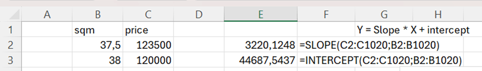
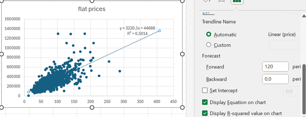
I have extracted data from https://asuntojen.hintatiedot.fi/ about flat prices in Espoo. Can we predict a flat price based on apartment size ?
The data consists of 1019 flat prices and apartment sizes. The idea is to check is there a correlation between flat price based on apartment size. How much should a flat of 400 square meters cost ? The largest flat in the data sample has size of 288 sqm. How much do the prices vary ?
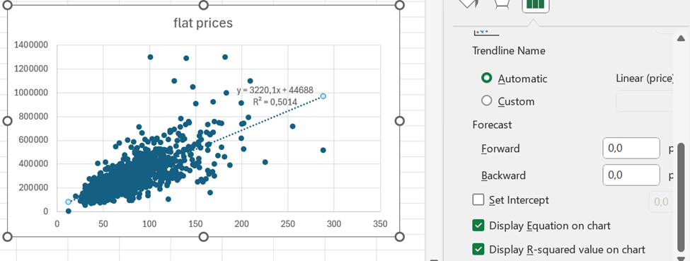
First, a scatter graph was created. Independent variable, apartment size, was set in X axis and dependent variable flat price in Y axis.
We see visually some trends, the bigger flats get, the wider is also deviation.
The correlation is roughly 0,71. That can be calculated with CORRELATION function. That function includes only two arguments, X values and Y values.
To calculate the trend, we need SLOPE and INTERCEPT functions.
Y = SLOPE * X + INTERCEPT
SLOPE calculates how steep the regression line is and INTERCEPT where Y axis and regression line meet.
Both the formulas have two arguments: values for Y axis and values for X axis.
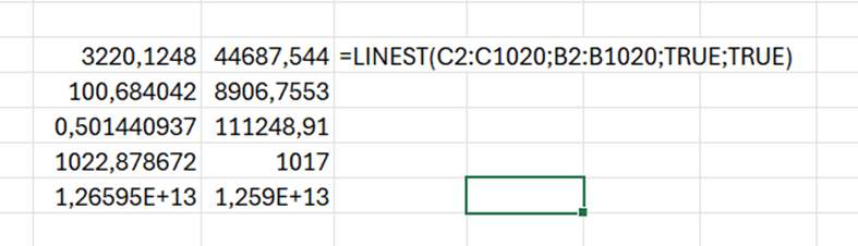
Another way to have the SLOPE and INTERCEPT values, is to use LINEST function.
SLOPE and INTERCEPT are in the first row. 0,50 is the R squared value. The LINEST function returns several values, but SLOPE, INTERCEPT and R squared are useful for us.
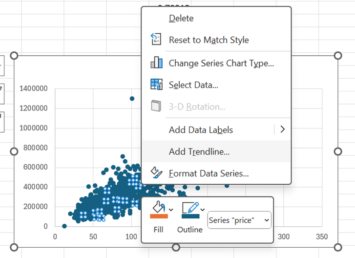
Another way to define the trend line and R squared, it to have right mouse click on top of the scatter graph. The select add trendline.
Scroll bit down to see the tick boxes display equation and R squared value. Then the values are visible on the graph.
Based on the equation, the price of the flat with 400 sqm would be appr. 1,3 M€.
When you format trendline, you can add forward value. 400 sqm flat would cost less than 1,4 M€.
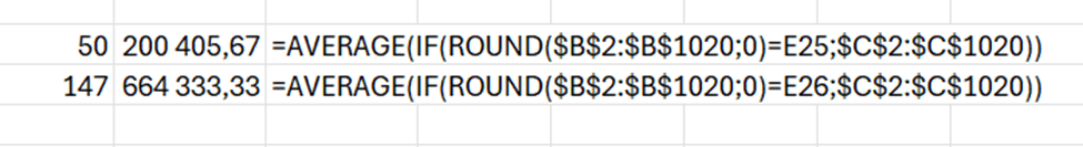
One additional topic is standard deviation. We can see from the graph flats with 50 sqm have less deviation than flats with 147 sqm.
=STDEV.P(IF(ROUND(B2:B1020;0)=E21;C2:C1020))
This is the formula, which counts standard deviation for the flats with specific size. The flat sizes are presented with precision of 0,5 sqm. Therefore, the flat sizes are rounded to full square meter. In E21 cell we have the flat size 50 sqm and in E22 147 sqm.
For a flat with 50 sqm, the standard deviation is appr. 56,5 k€.
But with flats of 147 sqm, the standard deviation is nearly 280 k€.
When we count the average price of a flat of 50, that is around 200k€ and for 147 sqm flat around 664 k€. The standard deviations for flats are significant. Therefore, estimate for a flat of 400 sqm, includes variation.
If a flat of 400 sqm costs roughly 1,3 M€, a standard deviation could be around 400 k€.
If you want to automate something in Excel, you might want to use Macros and Visual Basic. That’s what I have been doing.
Let’s take a very simple example. When you have a sum cell, the result should be framed with a bigger font.
When I recorded the macro, the result was sum-macro. The VBA script is attached to the end of this blog.
Check if you have automate tab available in the Excel.
We can record new scripts in a bit similar way as recording a VBA macro.
Press “Record Actions”.
Record actions is writing a log.
Frame the cell and make the font bigger.
The Record Actions recorded my actions.
Press stop.
I can change the script name.
I replaced the “Script 4” by more descriptive “Font_frame”.
This is the start of the script. Green lines with slash slash are comment lines. The script has generated also comments, which is a benefit compared to VBA.
In the sixth line, the script has created a static cell reference, C4. It would be better if we had relative references like active cell. The changes are done into active cell, not C4, unless C4 is the active cell.
We need to change the selectedSheet.getRange(“C4”) with workbook.getActiveCell().
I also changed the comments, even though it does not affect the result. The change should be done to active cell, not any predefined cell.
Office Scripts are stored in OneDrive as osts files.
If you want to execute an Office Script, select “All Scripts” under automate ribbon. Then press play.
The result.
The VBA and Office script are doing the same task, they both make frame to selected sell and make the font bigger. The VBA code is quite long, even though I expected the VBA to be shorter clearer than Office Script.
VBA is older technology than Office Script. It is good to familiarize yourself with Office Scripts.
You might have faced the issue that the system does not understand Scandinavian letters ä, ö or å. Instead, the normal a or o should be written instead of ä, ö or å. This will happen with email addresses. I will show an example of emails bit later.
Yrjö Pyykkönen should be written as Yrjo Pyykkonen.
This we can tackle with SUBSTITUTE function.
The function consists of three main arguments: the text where substitution is done, the value to be substituted and the value to substitute.
In this case, we are checking the value in B3 cell. If there are any “ö” letters, those are substituted by “o”.
This does not substitute capital letters, like “Ö”.
Only minor ö was substituted.
However, we can create a nested SUBSTITUTE.
The sentence in D3 is =SUBSTITUTE(SUBSTITUTE(B3;”ö”;”o”);”Ö”;”O”).
If you want to substitute “å” and “ä” to “a”, and “ö” to “o”, both capital and small letters, then the sentence is:
Fill the first name and the last name. Then create an email address for the person.
Select data – flash fill (under data tools).
AI based functionality is creating the email address for all the names based on the model for the first name. This is supervised learning for AI.
Looks good, but Åke Sandström has Scandinavian letters in the email. Scandinavian letters should not be in the email.
The sentence in the cell E3 is =SUBSTITUTE(SUBSTITUTE(SUBSTITUTE(SUBSTITUTE(SUBSTITUTE(SUBSTITUTE(B3;”Ä”;”A”);”Å”;”A”);”Ö”;”O”);”ä”;”a”);”å”;”a”);”ö”;”o”)
After the Scandinavian letters have been substituted, the emails can be created based on names without Scandinavian letters.
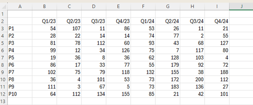
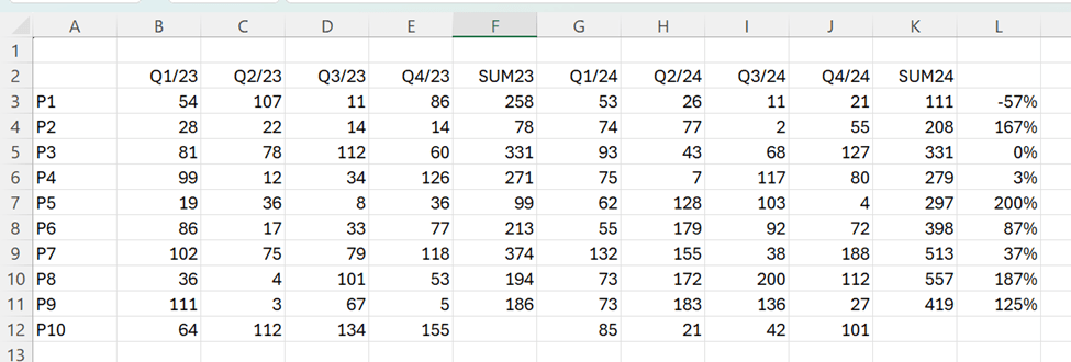
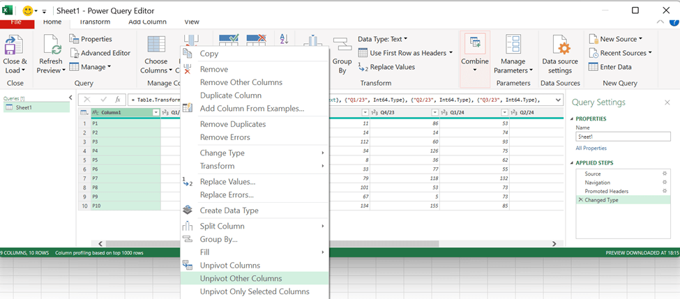
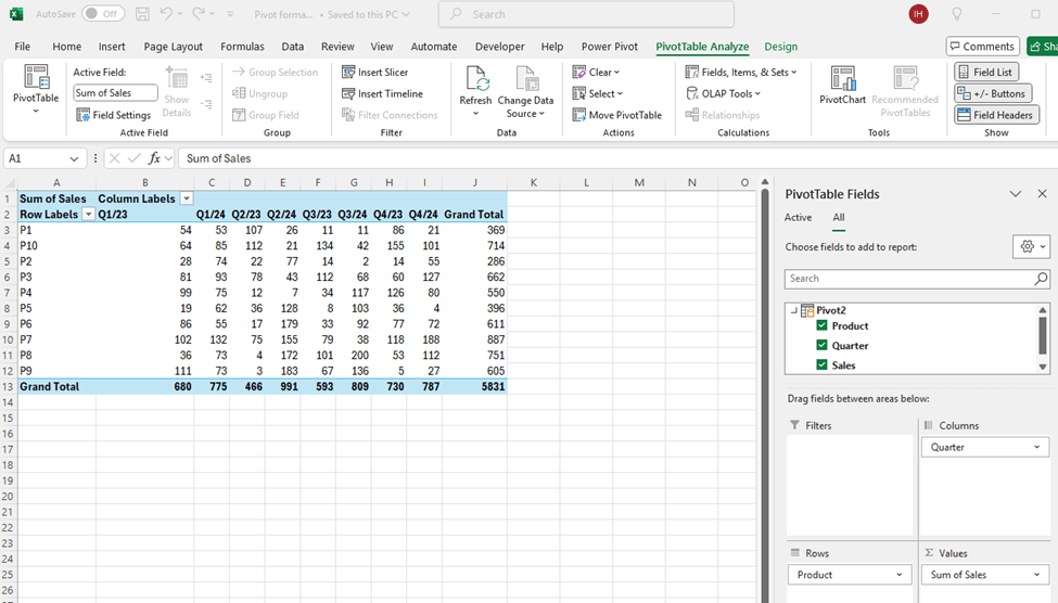
We have a sales report about products P1 to P10 by quarters from Q1/23 to Q4/24.
Which of the following products saw the largest increase in sales from 2023 to 2024 ?
We can calculate manually the sums for 2023 and 2024 and calculate the change between the years. Sales for P5 have increased mostly when measure the relative change.
This way we need manual adjustments. We could make a data model and count with DAX.
The data is not in pivot format. The data should include fields product, quarter and sales volume. The data should not be in matrix format.
Download the data into Power Query, activate the first column and then select right mouse button and unpivot other columns.
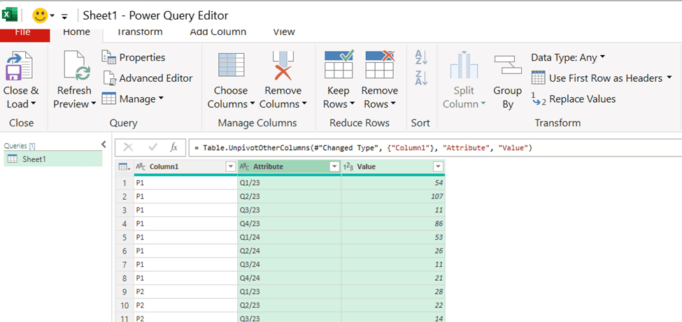
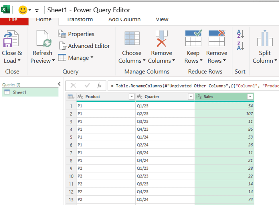
Now the data is in Pivot format. Add the column headers.
The power query data is loaded into data model. Each row contains product, quarter and sales volume.
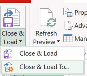
Choose close & load to…
Select only create connection and activate add this data to the data model.
Now we have the same data but on top of the data model.
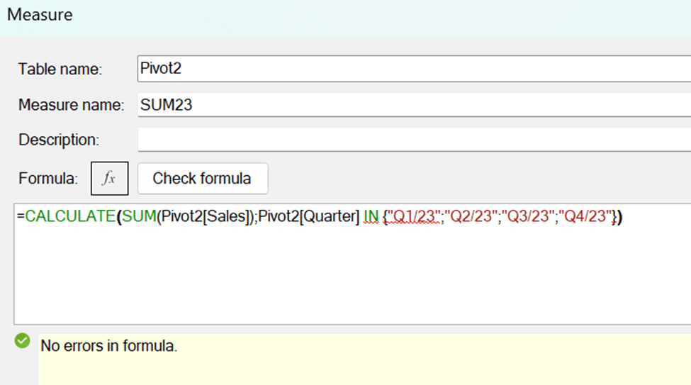
We need the formulas to calculate the year total with DAX.
SUM23 = CALCULATE(SUM(Pivot2[Sales]);Pivot2[Quarter] IN {“Q1/23″;”Q2/23″;”Q3/23″;”Q4/23”})
SUM23 sums the quarters from 2023.
Pivot2 is the table. Sales is the field for sales volumes. Quarter is the time field. Q1/23, Q2/23 and so on are the values in quarter field.
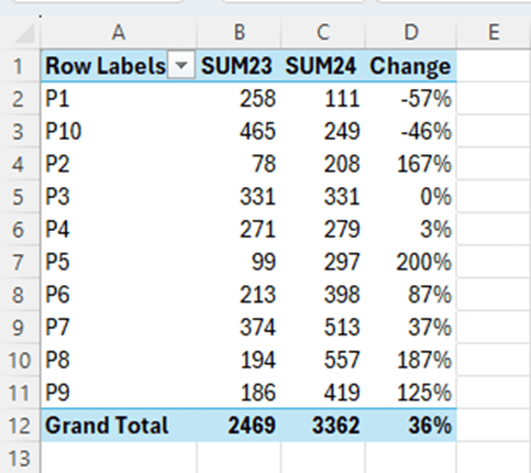
The same pattern works for the total sales in 2024:
SUM24 = CALCULATE(SUM(Pivot2[Sales]);Pivot2[Quarter] IN {“Q1/24″;”Q2/24″;”Q3/24″;”Q4/24”})
Finally, we calculated the change between the years.
Change = ([SUM24]-[SUM23])/[SUM23]
Sales for P5 increased most between 2023 and 2024 compared to other products.
We have the same results but with less manual work. We have the data in data model and DAX was calculating the results. The benefit with data model is, that we can create other measures with DAX on top of the data model.
I am creating graph and conditional formatting from simple sales data. Instead of doing all manually, I will check the Copilot integrated into Excel first.
When working with Copilot, activate the autosave. I saved the file in OneDrive.
This picture was taken in the top left corner.
I created simple sales data.
The copilot is in the top right corner in data.
Additionally, Copilot icon can be found in the home ribbon.
I activated the data range and selected the Copilot and “Ask Copilot”.
Copilot menu appeared on the right. I pressed apply color and formatting.
I wrote in the chat box “Highlight cells with highest values.”.
I pressed apply.
The result, the highest value is coloured.
I wrote “show data insights”.
I pressed add to a new sheet.
Here is the graph.
This graph visualizes the sales volumes between different products. P5 and P2 have clearly the highest volumes.
I wrote “create a pie chart” in Copilot chat box.
The results. I added to a new sheet.
This is what Copilot created. The graph can still be modified like header can be changed to a more descriptive and the legend could be printed with bigger font.
Double click the header and re-write the header.
Select the right mouse button on top of the legend and select font.
There are many ways you can test Copilot. I just took some examples when creating a graph and conditional formatting. If results from Copilot are not fully completed, you can always start the work with Copilot and finetune the task manually. That might save time.
In my previous blog, I presented how to get data below in a reportable format in Excel. The same can be done with Access.
year;month;account;amount
2025;1;1000;167
2025;1;1010;640
2025;1;2000;15
2025;1;2000;965
2025;1;2010;278
2025;2;2010;738
2025;2;2010;973
2025;2;2010;108
2025;2;1000;947
Select new data source – from file – text file.
Browse the file. I have not created the table, so I selected the first radio button.
I selected the delimited option, as the data is separated by semicolon.
The first row is header row and the parameter is selected.
Field options are left untouched.
Access is creating a primary key field with running number.
Give the name of the new table.
Before you press finish, you can check advanced…
All the fields and data types can be reviewed. All the fields have long integer data type.
The data is neatly in Access table. Field names are taken from the file.
A simple query once data is in place.
The sum is the same as calculated with Excel.
Sales are queried by year and month.
In my previous blog I demonstrated data – text to columns and TEXTSPLIT functionalities in Excel to see the data in readable format. However, Access is suitable also for reporting purposes. Flat file was in this case easy to import into Access. I did not create the table, but the table was created while importing the data. In my test data I did not have decimals. Sometimes decimals have caused issues for me.
You have downloaded data from accounting system. The data includes posting year, posting month, account and amount.
year;month;account;amount
2025;1;1000;167
2025;1;1010;640
2025;1;2000;15
2025;1;2000;965
2025;1;2010;278
2025;2;2010;738
2025;2;2010;973
2025;2;2010;108
2025;2;1000;947
The data should be presented in a reportable format.
That can be done via data – text to columns.
Now the data is in countable format.
The same thing can be done with TEXTSPLIT. The function consists of only two mandatory arguments, the cell and the separator. Other arguments are not mandatory.
Copy the function downwards.
The function splits the string, but TEXTSPLIT splits texts and considers the values as text. Therefore, the cells are aligned in left
The TEXTSPLIT can be framed with NUMBERVALUE, which returns to a numeric value. The first row is text and that does not understand the NUMBERVALUE function. The cells are aligned in right, the values are numbers.
The formula text in F11 is: =NUMBERVALUE((TEXTSPLIT(B11;”;”)))
One way to distinguish whether line is text or number is to take four first digits and set that as numeric value. Then we test that with ISNUMBER function. If the function returns TRUE, then the row is numeric data. If the function returns FALSE, then the data is textual data.
Therefore, we have to start with IF-function, which would check whether line is numeric data and NUMBERVALUE function or if the line is text data and NUMBERVALUE is not needed.
Now only one sentence can tackle both text and number values. The first row is text and other rows consists of number values.
To sum up, the text to columns is still a very handy way to separate a string with separators into multiple cells. As we saw, it is possible to tackle also with TEXTSPLIT, but the sentence got quite long. If you want to keep the source data and reportable data separately, then TEXTSPLIT is a possible solution. Text to columns is separating source data to cells and the original source data is not available any more.
Let’s think you have physical storage. When you purchase goods into your warehouse, you have fixed ordering costs per order. The more you order, the lower the ordering costs gets per piece. On the other hand, you have carrying costs for running a warehouse, the more goods you have in the warehouse, the more it costs.
One way to calculate the economic order quantity is simply to count ordering costs per piece plus carrying costs per piece. Then we check the lowest point of total costs per piece.
Column B is a running number of pieces in stock. C2 is ordering costs, 300. That is divided per piece in stock. It costs 4 units to have one piece in stock. That is multiplied by stock piece in D-column. In E-column I have divided the total costs per piece.
Economic order quantity is the lowest point of total costs per piece. We can define that visually to be 9 pieces.
How can we automate the defining the lowest value ?
One way is to create a graph. Activate the range B3:E20 and select insert – line or area chart.
I selected the first 2-D line chart.
The default graph is quite good. We could still change the title and Y axis scale.
Activate the Y-axis, press right mouse button on top of Y axis and select format axis.
The maximum was changed from 350 to 200.
The graph is now more human readable as the Y axis ends with 200. The total cost is at lowest point, when ordering costs and carrying costs intersect. The point is nine.
MIN is very simple and common function, here it is very useful to find the lowest value in E-column. We can find the lowest value, 69,33, visually. If the data set were larger, it would get more difficult to see which value is the lowest one.
One way to define economic order quantity per piece is MATCH function. The function consists of three arguments: lookup value, lookup array and match type. In this case, lookup value is E2, the minimum value in E-column. The lookup array is the data range E4:E20 where we have total costs per piece. The match type is 0, we are looking for exact match for E2 in E-column. The function returns the value from B-column. That happened pretty easily. The economic order quantity in our case is nine. Then the warehouse costs are at the lowest point.
When MATCH-function is functioning, you can change some input values, and check if economic order quantity changes.
If ordering cost is 340 and carrying cost 3, then economic order quantity is 11.
I have seen INDEX-MATCH nested functions to have been used for cases like this. What we did is like negative vlookup. When vlookup checks the value in left column and then picks up the value in right column, we did opposite. We were looking for value in E-column, 69,33. When we found that, we check what is the value in the most left column, B-column. The value there is 9.
Here is a simple data. The columns are product, region and sales.
To count how many products were sold per region, we need a pivot report.
This was an easy task to create pivot table in Excel. Region was selected as columns and product as rows. Sales is a numeric value per region and product combinations. Now we can see how many of each product was sold in each region. Pivot gives us a big picture about the data. Our sample is very limited that we could see how pivot is structured.
We have the same data in Access.
This is our table in design view, we have product and region as text columns and sales as number column.
In validation rule I have set allowed values, validation rule was entered also for products.
Select create – query wizard.
Select crosstab query wizard. This is a list of standard queries.
Select the table where the data is taken.
Row heading is selected.
Column header is selected.
The value context is the sum of sales. In this screen you can select if the sums are included in the report.
Name your query.
The results are the same as in Excel.
If you have data in Excel, you don’t have to move that to Access to have a pivot report. However, if you have the data in Access, you don’t have to move the data into Excel to have a pivot. Access includes also pivot functionality. The Pivot is called a crosstab in Access.
To test the pivot also in MySql, I created a similar table than in Access. Id is a primary key with automatic numbering. Product and region fields have checks that only allowed values are entered. This is validation rule in Access.
Then I populated the table with values.
The Pivot is reported with this SQL query:
In this query you first define the header for rows, we have the pivot with products in rows. Aliases No and So will be column headers. We are counting the sum for products in rows and regions in columns. If the region is North, then the sum for sales fields is counted. That number is presented under No column per each product. Product is not in aggregated functions, therefore we have GROUP BY product sentence.
For some reason, the SQL query does not work with Access, but it works with SQLite.
Pivot with SQL is not so practical as with Excel. If you don’t want to transfer the data from SQL into Excel, you may have pivot in SQL editor, too. If you once download huge dataload from a system into Access, for example, might crosstab query be useful. Access is a useful tool also for pivot reporting.
Here I have a sample data extracted form a sales system. The string includes the following data:
1…3 Initial zeroes
4…5 Month, time of sales
6…7 Day, time of sales
8…12 Region, if the region includes four digits, then 12th digit is zero.
13…14 Product
15…21 Sales quantity with initial zeroes, if needed
This data should be presented in human readable form.
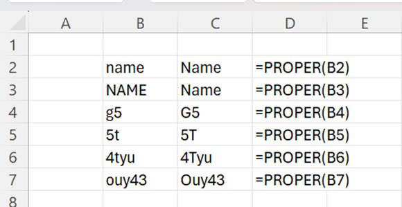
With MID function we can extract certain number of characters from the string. Two functions make the data more readable, PROPER and NUMBERVALUE.
PROPER makes the first letter capital letter and remaining letters minor letters.
Cell category for B2 and B3 is TEXT. If I refer to B2, like I have done in C2, the cell category for C2 is TEXT. I cannot include those cells in any calculation. When I use NUMBERVALUE function, the result of the function is of cell category number and can be used in calculations.
Back to sample data, I have extracted here the data without PROPER and NUMBERVALUE.
The sentences are:
Month =MID(B2;4;2)
Day =MID(B2;6;2)
Region =IF(MID(B2;12;1)=”0″;MID(B2;8;4);MID(B2;8;5))
Product =MID(B2;13;2)
Amount =RIGHT(B2;6)
With region, the sentence has to check first whether the 12th digit is zero, meaning that region is spelled with four digits. Then only four digits are extracted starting from the 8th digit. If 12th digit is not zero, then five digits are extracted starting from the 8th digit.
The amount could be taken also with MID function, then the sentence would be =MID(B2;15;6).
The result is clear, but the numbers cannot be calculated, and it would look better if regions started with capital letter, and the product were written with capital P.
Now I have used PROPER and NUMBERVALUE functions, and you see the difference immediately.
Texts look better, and even more important, amounts are automatically in calculable format. Also, months and dates are in number category, if you want to calculate, for example, with functions MIN, MAX or AVERAGE.
Month =NUMBERVALUE(MID(B2;4;2))
Day =NUMBERVALUE((MID(B2;6;2)))
Region =PROPER(IF(MID(B2;12;1)=”0″;MID(B2;8;4);MID(B2;8;5)))
Product =PROPER(MID(B2;13;2))
Amount =NUMBERVALUE(RIGHT(B2;5))
Typically, PROPER and NUMBERVALUE are nested functions. First you are taking data with functions like MID, and when you have the result, you just frame it with PROPER or NUMBERVALUE. Also, these functions are not only for cosmetic reasons, but also to automatize the calculations.
Here you have list of values in different currencies. What is the sum of valus in Euros ?
47 usd
5433 nok
578 dkk
7554 sek
3222 sek
321 eur
This can be tackled with VLOOKUP function.
The sentence in the cell D2 =B2/VLOOKUP(C2;$F$2:$G$6;2;FALSE).
VLOOKUP is checking value in C2 “usd” and checking that in F2:F6 range. When the string was found, the functions picks up the value in one cell right for string, 1,02. Then B2 is divided by 1,02.
The sum of D2:D7 is calculated in D9.
With Python we can calculate the same thing.
The exchange rate is stored in one cell, in Python dictionary.
The content in C2 is:
xr = {
“usd” : 1.02,
“sek” : 11.48,
“nok” : 11.74,
“dkk” : 7.44,
“eur” : 1}
The formula to count the value in Euros in D4 is:
xl(“B4”)/xr[xl(“C4”)]
The formulatext function shows the formula from D4 in F4.
The exchange rates are in dictionary in C2.
The idea of both the solutions is the same. Python is more concise as exchange rates are stored in one cell.
When we normally use SUMIF or SUMIFS we calculate the sum for values which are fulfilling a criterion. Now we are calculating the sum for exclude condition.
You have a list of values in B column and a letter in C. You need to count the sum for all the other letters but not a, b, and c. We know which values need to be left out.
If the value in C column is something else than a or b or c, then you should count the sum in column B.
This can be done in several ways.
The IF sentence in in D3 is =IF(NOT(OR(C3=”a”;C3=”b”;C3=”c”));”X”;””).
If C3 is not a, b, or c, then mark X, if C3 value is a, b or c, then leave the value blank.
Then the SUMIF is counting the values with X.
If you remove NOT formula and change X from if_value_true to if_value_false, you will get the same result.
I just use NOT formula very seldom, so I wanted to test NOT here.
An advantage with this solution is that it is easy to visualize but the disadvantage is that you need to add one new column.
Another way is to calculate with SUMIF what is the sum for a + sum for b + sum for c. Then the total is diminished by three SUMIF formulas.
The sentence is =SUM($B$3:$B$12)-(SUMIF($C$3:$C$12;”a”;$B$3:$B$12)+SUMIF($C$3:$C$12;”b”;$B$3:$B$12)+SUMIF($C$3:$C$12;”c”;$B$3:$B$12)) .
Now we don’t need to add an extra column but the sentence is quite long.
One solution is to use SUMIFS function. SUMIFS holds several criteria, when SUMIF operates with just one criterion.
First, we define the sum range B3:B12. Then we have criteria range for the first criteria, that is C3:C12. The first criterion is that value should not be a, that is written “<>a”. The second criterion has the value “<>b” and the third “<>c”.
For me, the first example with an additional column is the clearest way to calculate the excluding sum if. That means creating an additional column, but I still prefer that way.
You might have seen three dimensional Excel formulas.
Product one.
Product two.
Product three.
Each worksheet holds sales data by sales region and by month.
Each worksheet presents sales data per product. The reports above cover the products from one to three.
There are three dimensions: month, sales area and product. Just two dimensions, month and sales area, were presented in one worksheet.
You can create SUM functions across the three worksheets.
Total sales for North area or total sales for the month August can be calculated manually. This is not convenient for ad hoc queries.
Better way would be to have data in pivot format. Then month, region, product and sales amount should be separate columns.
For example:
Month region product sales
Jan North P1 23
And so on.
Add a column for the product, P1 in the sheet above, in all the three worksheets.
Take data into power query per each worksheet.
Activate the columns with header, meaning the sales areas and press right mouse button. Select unpivot only selected columns.
I added names for new column names month, product, area and sales.
Repeat this for each worksheet P1, P2 and P3, that the sheets have the same column names in the same order.
Select append queries. The idea is to combine all the queries as one long query.
Press ok.
Import the data into data model. Create a pivot on top of data model.
The August sales is 197.
Sales for North area is 587.
When we have power query and power pivot, we can forget three dimensional worksheets.
In this example, I did not write even any DAX. It is possible to have self made measures with DAX, but it just was not needed to count total sales for August and North area.
A good thing is that the same process works also in Power BI.
My Power BI is in Finnish, but the idea is the same as in Excel.
In Power BI Aug sales is 197.
The same results in Power BI.
When a process exists in power query, you can use that both in Excel and in Power BI.
If three dimensional Excel worksheets were once used, nowadays are power query and power pivot very convenient. As said, you can use either Excel or Power BI.
You have three accounts 30003, 30004 and 30005. The balances are as follows:
D C
30003 34 50
30004 34 34
30005 87 21
For 30003 credit is higher than debit. 30004 hold zero balance as both debit and credit are equals. 30005 holds debit balance as debit is higher than credit.
How could we do a report which shows the balances clearly ?
For example, 30003 D is 0 and C 16, 30004 is zero, 30005 D 66 and C 0.
The IF-sentence should be if D is higher than C, then D is D-C and C is zero. If C higher than D, then C is C-D and D is zero.
The sentence in D3 is =IF(B3>C3;B3-C3;0) and E3 is =IF(C3>B3;C3-B3;0).
Another option to visualize account balances is to define whether balance is debit or credit and what is the balance.
The balance for 30003 is C 16, 30004 is DC 0, and 30005 is D 66.
We avoid some unnecessary zeroes.
The debit or credit is defined with dual IF-sentence. First if is checking if C and D have equal balance, then indication is DC. If this is not the case, but D is higher than C, then the returned value is D, otherwise the value is C.
The sentence in D3 is checking if D equals to C, if so, then the returned value is DC. If D is higher than C, then the value is D, if not, then the value will be C.
E3 is checking if D is higher than C. Luckily, the sentence works also for cases when D is as high as C, returning zero.
Maybe showing summarized balance is more informative than showing both debit and credit balances. All the examples in this blog were done with IF-function.
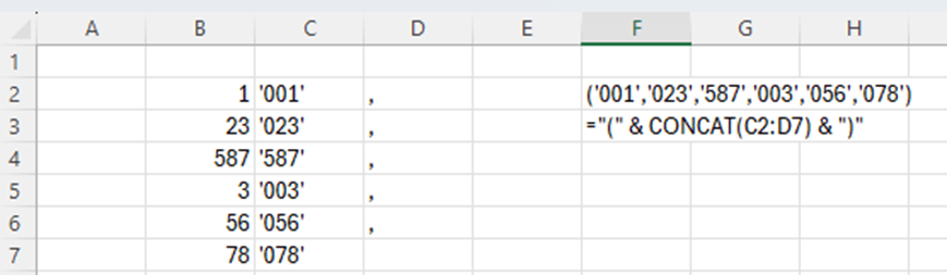
Values in database are numeric like 1, 23, 587, 3, 56, 78.
When you are writing an SQL query you need to write values between apostrophes and values consist three digits, if the value is with one or two numbers, then initial zero or two zeroes are needed. Finally values are separated with commas and framed with brackets.
1, 23, 587, 3, 56, 78 are written (‘001′,’023′,’587′,’003′,’056′,’078’). You can do this manually. However, Excel can help you.
If length of the value is one, then at the start we need to add ’00 and after the value ‘. If the length of the value is two, then we need to add ‘0 before the value and ‘ after the value. In case value is three digits long, then only apostrophes are added ‘ before the value and ‘ after the value.
I added commas after the values apart from the last value. CONCAT formula is creating one string from several cells. CONCAT is merging cells even though the cells would not be in a line.
Only brackets are missing.
Now also brackets are in place.
We can write the query line. Copy the cell F2 into your SQL editor.
WHERE field1 IN (‘001′,’023′,’587′,’003′,’056′,’078’)
Writing the WHERE line manually is not a big deal, but if you have long list of values, then this blog might be useful. As said earlier, it is nice to have Excel in use, even though it would not be required.
This data is downloaded from Maven Analytics data playground, here Free Data Sets & Dataset Samples | Maven Analytics . Thanks for Maven Analytics for publishing this data set. There are also four questions about data. I have answered here the question.
This time I have used Excel and Power BI to analyze the data.
Which titles sold the most worldwide?
Excel.
Power BI.
Call of duty games are the best sold games. Grand Theft is the best-selling game but Call of duty with all the variations is still more popular than one Grand Theft.
When having a list of result, maybe Excel is a better tool.
2. Which year had the highest sales? Has the industry grown over time?
A new column release_year was created in power query.
Excel.
Visualization in Power BI.
For this question, Power BI visualization is a good way to present which years were the top ones.
The best selling year was 2008. Generally the years 2007-2011 were the peak period.
3. Do any consoles seem to specialize in a particular genre?
In Power BI, I have selected the matrix.
This is an example of a matrix.
When we don’t have graphics but just matrix, Excel is doing good compared to Power BI.
Data provides several observations, here are some:
NG is specializing only in fighting and slightly sports. GBG was concentrating mainly on adventure and bit on role-playing. PCFX has only role-play.
The three consoles NG, GBG and PCFX which have concentrated on some genre, have not been selling very much. Top selling consoles like PS2, PS3 and PS4 are involved in many genres.
4. What titles are popular in one region but flop in another?
There are many examples of games which sold well in one region but poorly in another.
Assassin’s Creed and Assassin’s Creed II sold well in Europe&Africa and in North America but poorly in Japan. ATV offroad was popular in North America but not in Europe&Africa. Backyard Baseball and Backyard NFL Football were popular in North America but not in Europe&Africa. This is obvious as those sports are popular in North America. On the other hand, Brian Lara Cricket was doing better in Europe&Africa but not in North America.
Sales numbers are taken from different regions, Europe&Africa, Japan and North America. Column E is EA sales minus NA sales.
The data which is analyzed here is taken from Maven Analytics Data playground Free Data Sets & Dataset Samples | Maven Analytics . The data set is UK Train rides. Thanks for Maven Analytics for publishing the data sample. I have also answered the four questions in the data playground.
The data is downloaded into Microsoft Access. There I have used SQL queries. Then I made a data model in Excel. The Access database is the source for my data model in Excel.
The most popular travelling times in the morning are 6:30 and 8:00. Looks like 7:00 is not popular time at all. People are leaving for school or for work early 6:30 or bit later 8:00.
In the evening most popular travelling times are 18:45 and 17:45. There is a difference of one hour. 18:00 is not popular time.
3. How does revenue vary by ticket types and classes?
The query:
SELECT SUM(Price), [Ticket Type], [Ticket Class]
FROM Railway
GROUP BY [Ticket Type], [Ticket Class]
ORDER BY SUM(Price) DESC
With Excel, the Dax is simple. Just calculate the sum just like in Excel.
=sum(Railway[Price])
Standard tickets produce most of the revenue. Advance is selling best and anytime worst among the ticket types.
4. What is the on-time performance? What are the main contributing factors?
SELECT COUNT([Reason for Delay]), [Reason for Delay], ROUND(COUNT([Reason for Delay]) *100/ (SELECT count([Reason for Delay]) FROM Railway), 1)
FROM Railway
GROUP BY [Reason for Delay]
ORDER BY COUNT([Reason for Delay]) DESC;
To count how many times each reason for delay is appearing, we use COUNTAX Dax:
=COUNTAX(Railway, [Reason for Delay])
To have the total number of reason of delays, we have:
=CALCULATE(COUNTA(Railway [Reason for Delay]), ALL(Railway [Reason for Delay]))
To have a division we need to have DIVIDE command:
=divide([4_5_reason],[4_6_reason])
The most typical reason for delay is weather. The are two reason codes weather and weather conditions. The two could be summarized, then we would see that about one third of delays are due to weather.
I was using two tools to answer the questions in Maven Analytics playground: Access and Excel. Same answers could be found using both the tools. Data sets are useful as you can practice with the tools you like.
Correlation means how strongly two statistical variables are dependent on each other. Graphically, we can see the dependence in XY scatter graph. On Y axis we have the dependent variable (variable to be explained) on X the independent variable (explaining variable).
If the correlation is between 0,8 and 1 or -0,8 and -1, then the correlation is obvious.
We have simple data independent and dependent variables.
First, we calculate the averages.
Then we need to calculate the difference between the observation and average.
After that, we multiply the differences.
The next step is to calculate the squares for differences.
Then, we need to calculate the sums for differences in columns F, G and H.
Finally, we calculate the correlation by having multiplication of x and y differences, divided by square root of x and y difference multiplications.
The correlation in our case is roughly 0,959 which is a high value and there is a statistical dependence between independent and dependent variables.
To make it easier, you can just use either CORREL or PEARSON functions. Those functions return the same value as we calculated manually.
One quick way to calculate the correlation is to use data analysis. I have data analysis under data menu, last one in the right.
Select correlation.
Enter the input and output ranges.
The result is still the same.
Do you still want to have a scatter graph ?
The result is still the same.
Do you still want to have a scatter graph ?
Activate the data and select home – analyze data.
Scroll down to find the scatter graph.
Select the dots in the graph and press right mouse button. Select add trendline.
When you scroll downwards the format trendline, you can select display R-squared value on chart.
Now we have a trend line. We see that the dots are pretty close to the trend line.
R square is a square for the correlation.
R square indicates how many percents of changes in independent variable explains the changes in dependent variable. In our case that is 92 %.
This means one sales rep sold 0-5 pieces, two sales reps sold 6-10 pieces and so on.
First, we calculate the cumulative number of sales reps.
Then we calculate the percentual accumulation.
Three sales reps, roughly 11 % of all the sales reps sold 0-10 pieces, for example.
We should create an accumulative curve to see how many sales reps are selling tops 5, 10 or 15 pieces.
Note, that I have emptied B2, the header for X-axis values.
I activated the ranges B2:B7;E2:E7.
Select the correct graph.
I am using the two-dimensional line.
I got right away pretty good graph which does not require much modifications.
The Y-axis is till 120 %.
Activate the Y-axis, so that axis values are in a frame.
Select format axis.
Set maximum to 1,0.
Now the Y axis is up to 100 %.
We can see from the graph that only few percent of sales reps sold tops 5 pieces. Around 10 % of all the sales reps sold up to 10 pieces and roughly one third sold tops 15 pieces. Only about 10 % sold more than 20 pieces.