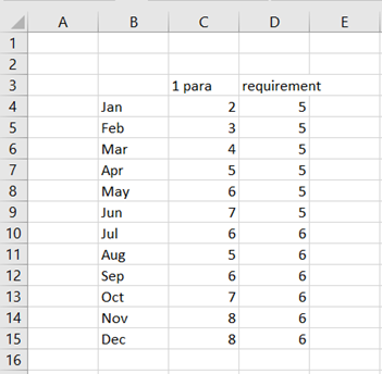
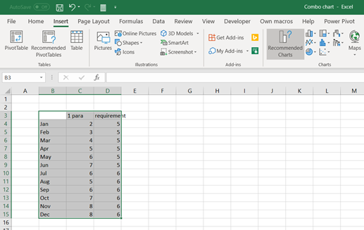
Data here represents monthly values for parameter one. Required level for parameter one is five for H1 and six for H2. Data should be published graphically.
Activate the data and press line symbol under insert ribbon.

Select the first icon in the row.

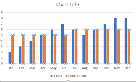
Blue line values are parameter values and orange the requirement values.
Alternatively, you can select

The bar icon.
Select the first icon in the row.
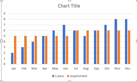
Both data series, parameter and requirement, are shown as bars.
Maybe the best option would be a combination between the two chart types, bars and lines, like in two earlier examples. Parameter one would be bars and requirement a line. If the bar crosses the line, then the parameter is above the requirement. If the bar stays under the line, then the parameter has not met the criteria that month.
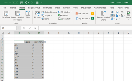
This can be selected in several ways in Excel.

Activate the data and select the combo symbol in chart.
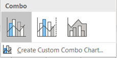
Select the icon for the ribbon.

Now it looks good, at least for me.
If you have already selected bar chart.
Activate the requirement values and press right mouse click.

Select Change series chart type to line.

Select all charts view and press the first icon in the header.
Select insert- recommended charts.

Select All charts view and press Combo in vertical bar. Then open chart type selection for requirement.

Requirement values are presented as stacked area. You can browse other chart types, too.
